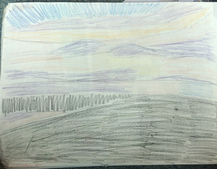
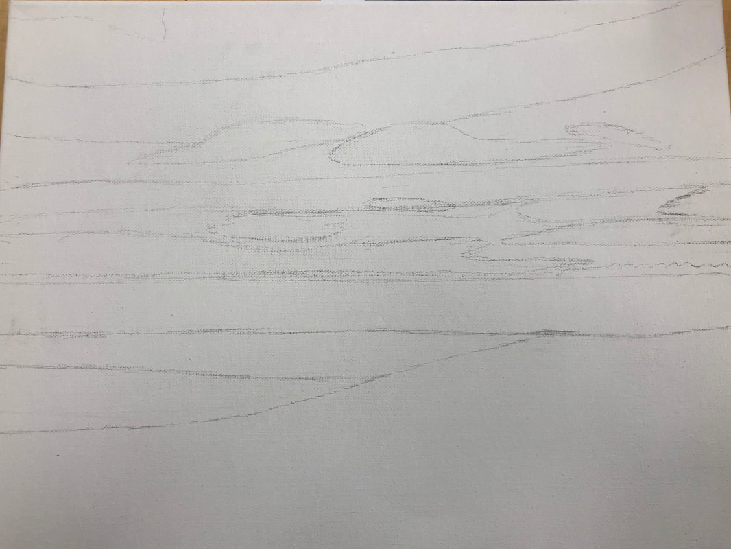
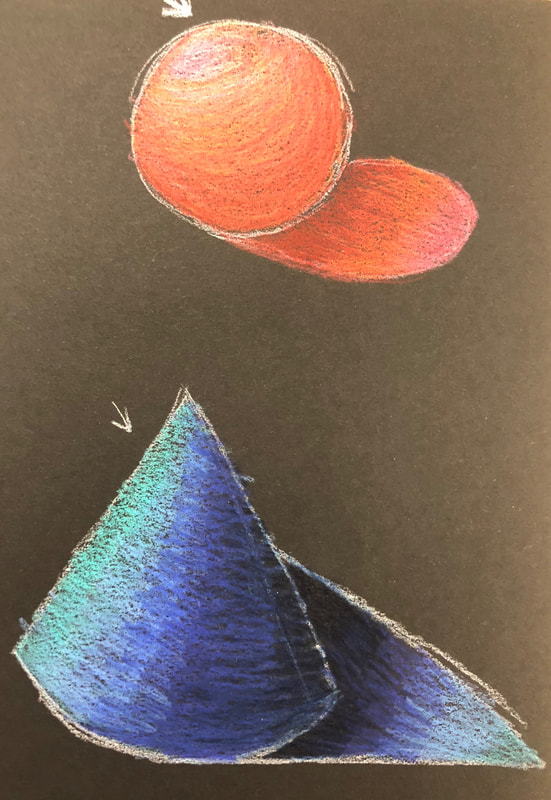
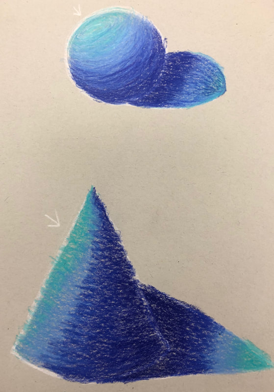
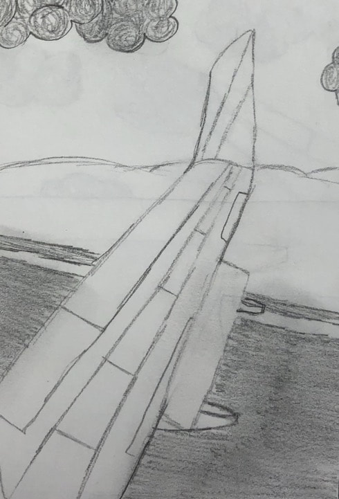
Planning Sketches
In Progress Pictures
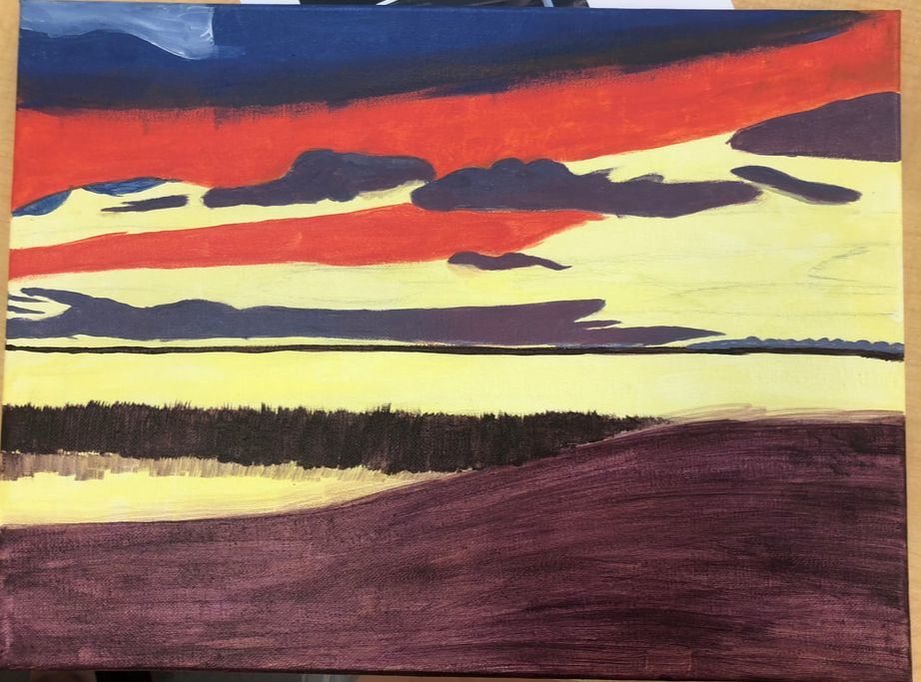
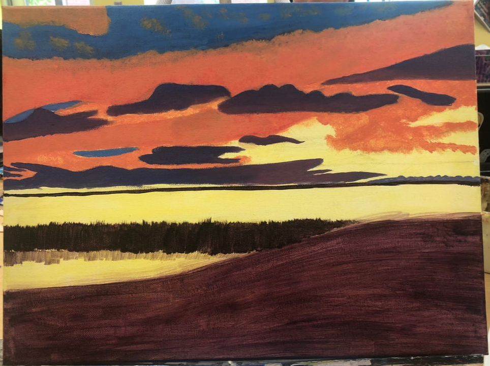
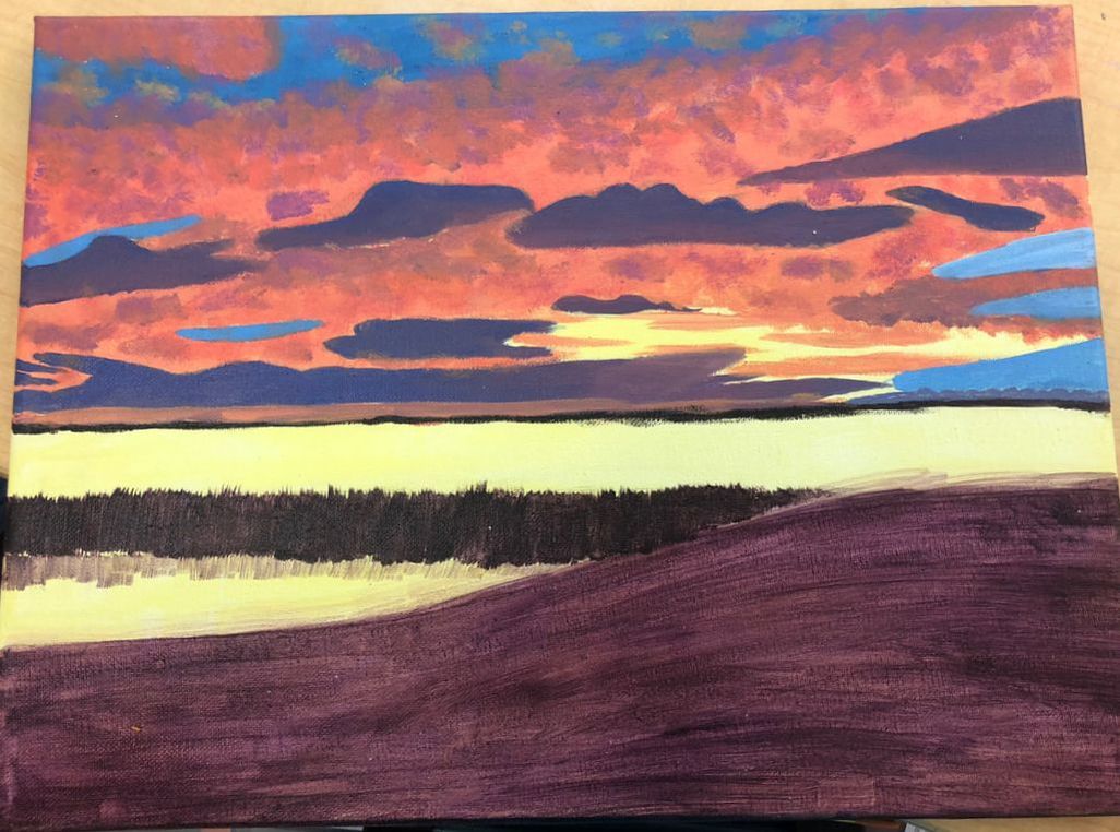
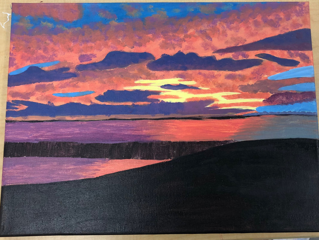
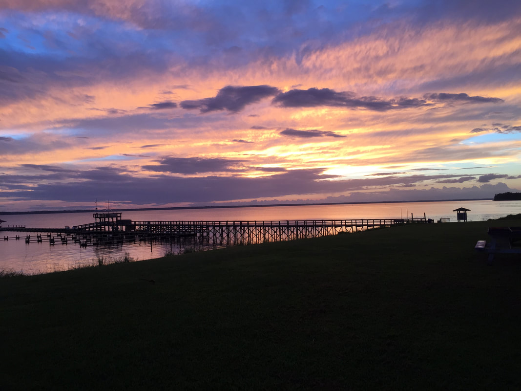
These are my in progress pictures. You can easily tell that this piece has changed a whole lot through out the process. In the top left corner is my first picture, all you see is the base wash and the base for the ground, pier, clouds and top of the sky. In the top right the sky color is changed along with the big coral cloud. In the bottom left there us more of the sky and clouds, plus the clouds more seamlessly blending together. In the bottom right the water is finally painted, surprisingly this took the shortest amount of time and I like it the most. Also the hill is finished along with the sun in the clouds. Final Piece
Critique Questions
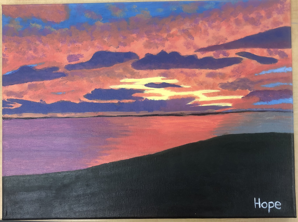
1. Who was your referenced artist for the painting? Name 4 main ideas you used from your research to create your painting. For my painting I was referencing the artist Joseph William Turner. The biggest main idea I used was the idea of focusing mainly on colors. As Turner's work evolved he began to focus more on colors because they fascinated him. The next main idea I used was not worrying about the shapes as much. In Turner's later works it all looks like blobs of color because he didn't think shapes were as important to the piece as the colors. Another idea I used was blending the colors, as much as I could. Most of Turner's paintings have a subject which stands out but then the background all blends together with different colors. The last idea I used was watering down colors. In a lot of Tuner's pieces he watered down the colors to give it more of a water color look. I didn't achieve this but I tried. 2. Describe the craftsmanship of your painting. (Is it neat and well executed?) I believe my painting is very well executed. There are a couple areas were the lines aren't as smooth because my hand accidentally jerked, and then I couldn't remake the right color to cover it up. You can see this along the line of the hill and the horizon line. The clouds are a different story. I think they look like they should but they are somewhat messy because when I was trying to blend to areas I used a different shade or tint of one of the colors. This is because I mostly likely ran out of the color I was using, this actually happened a lot. In hindsight I probably should have made more of a color before I started using it to paint an area. 3. What was the most difficult part of this project? The most difficult part of this project was probably just the sky in general. That seems very broad as it was half of the painting but still. For the water and the hill the only trouble I had was running out of paint. The problem occurred in the top half as well. In addition to that I had to attempt to create realistic clouds. I had to find the right color somewhat the right shape. I also had to figure out how to blend all the colors to look like a real sky and a real sunset. Also recreating the same colors was difficult because I kept forgetting the formula I used. 4. Describe your color choices and how they reflect the work of your chosen artist. For my color choices I really just matched the colors in the painting. I didn't do anything special according to the artist. At the beginning I tried to make it more like water color because that's how he painting. I couldn't water down the color and have enough pigment to cover the canvas. Eventually I scratched that idea and began to only slightly water down the colors. In the final you can't really tell I used this technique because I continuously went over the same areas multiple times to get it the way I liked it. 5. Describe how the style of your landscape reflects your chosen artist. In my painting I mainly focused on colors. Which is what Joseph William Turner did in his paintings. While creating my painting an accurate description is that I spent at least half of the time mixing colors. In Turner's paintings from the beginning to the end of his career the thing he loved the most was colors. I tried to channel this ideology into my painting. I did sketch out my painting, but it was more to see where each color would go. After i started painting I paid less attention to the lines and more to how the colors naturally went. 6. What do you think your chosen artist would say if he or she could see your painting today? If Joseph William Turner was alive today he'd probably be fascinated with the colors. As I've said before in all of his paintings he loved to focus on color because he thought it explained the world and was different for everyone and everything. My painting is mainly just colors. There is some shape to the colors unlike most of Turner's work. I don't think I could paint like that, having just color and no shape. He'd probably just look at all the colors and imagine them in the real world and how they'd be seeing them in real life. 7. What would you do differently if you were to do this project again? If I were to do this project again I'd probably plan out my painting better. I did have a decent plan before I started. I didn't think it'd turn out very well but I was hopeful. It didn't turn out the best. I changed my plans many times during this project. I originally was going to paint like water color. When that didn't work I started using less water, this worked pretty well. Once I finally finished the sky I was working on the water. There originally was a pier, but in the final I got rid of that because I didn't think it'd work in my painting plus I didn't know how to make it and I didn't want to mess up my painting since I actually ending up really liking it.
0 Comments
2 page paper on Joseph William Turner
Joseph William Turner Joseph Mallord William Turner was an English romantic landscape painter, watercolourist and printmaker. His style is described to have laid the foundation for impressionism. In his day Turner was considered a controversial figure. While today he is regarded as the artist who elevated landscape painting to en eminence rivalling history painting. As a teenager, his work was exhibited. He devoted his entire life to art. Turner was one of the few artists in his era that was successful throughout his career. In his will, Turner left the British nation over 19,000 pieces. Now most of the works are in the Tate and National Gallery; sadly many of his oils have badly deteriorated. Pablo Picasso Pablo Picasso was a spanish expatriate painter, sculptor, printmaker, ceramicist and stage designer. He is considered one of the greatest and most influential artists of the twentieth century. With George Braque he created cubism, which is an artistic movement that employs geometric shapes in depictions of human and other forms. Picasso has gained lots of respect for his technical mastery, visionary creativity and profound empathy. Because of this he is distinguished as a disquieting spaniard with sombre piercing eyes as a revolutionary artist. He spent about 88% of his life devoted to art. Picasso believed this artistic production would keep him alive. He significantly contributed to the modern art in the twentieth century. Picasso remains renowned for endlessly reinventing himself, switching between styles so radically different his life’s work looks the be a collection of 5-6 great artists instead of one.
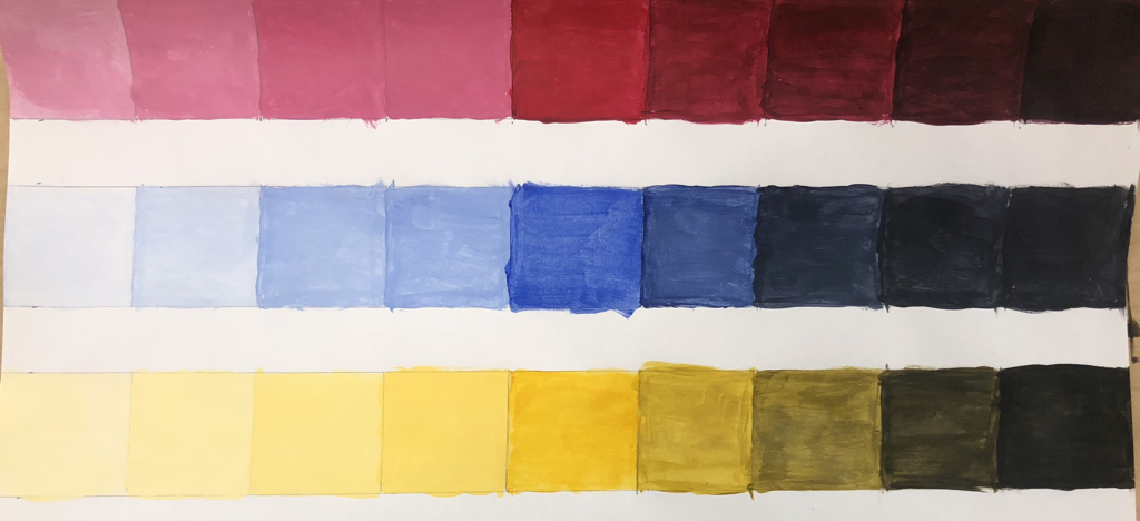
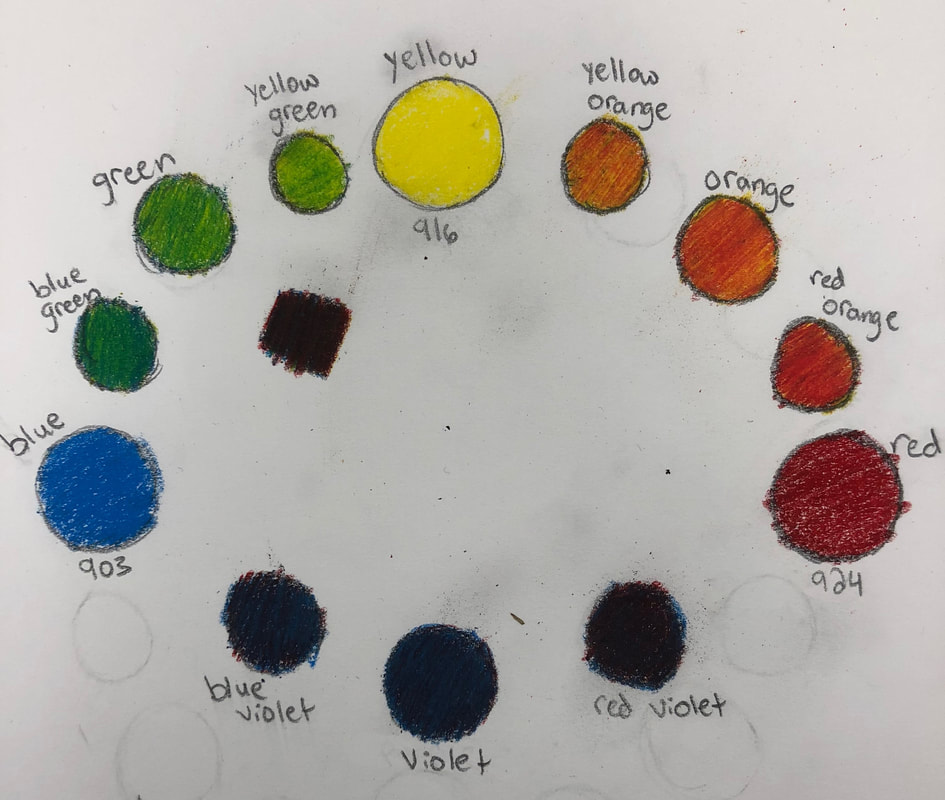
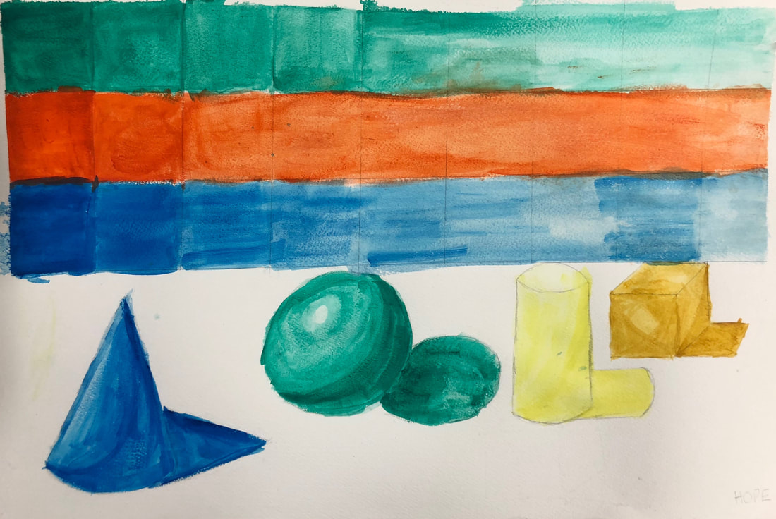
color pigment in the white changes the tint. The four boxes to the right are shades; that means the color is mixed with black. The amount of black in the color pigment changes the shade.
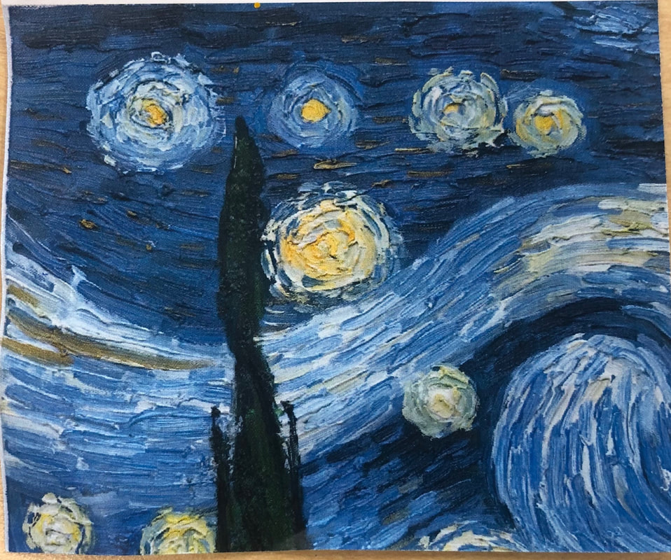
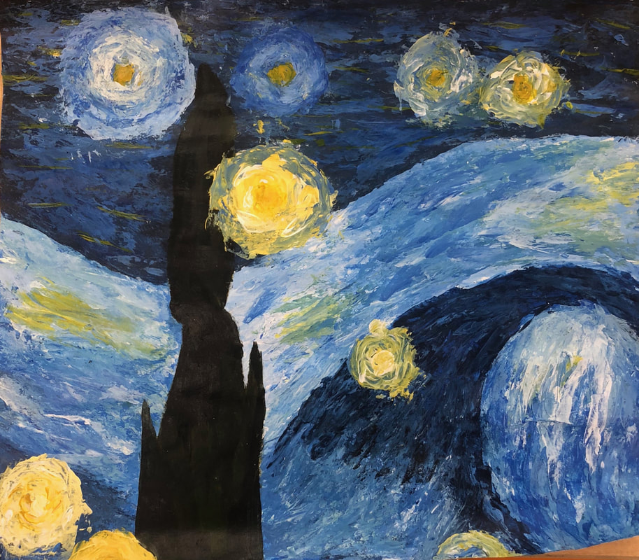
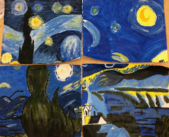 This was a little mini project we had to do to help strengthen our use of acrylic paint. My piece was of Van Gogh's Starry Night. This piece was challenging because I had to paint with a palette knife instead of a brush like I have for basically every other single painting I've done. I actually painted the foreground before the back ground which was not a very smart decision. I painted the green tower first and kept having to go over the edges of it. Later while painting I realized it would've been easier to start with the dark blue, then the light blue, the tower and finish with the stars. I did do the stars last because the were on top of everything else; besides that I went completely backwards. Finding the right colors was difficult, I didn't know you could make so many different shades of blue. Also the blue sometimes didn't dry all the way so it mixed with the yellow to make a green, that was always a problem. In the end I really liked how it turned out, some of the proportions are off but it's still very similar.
Planning sketches
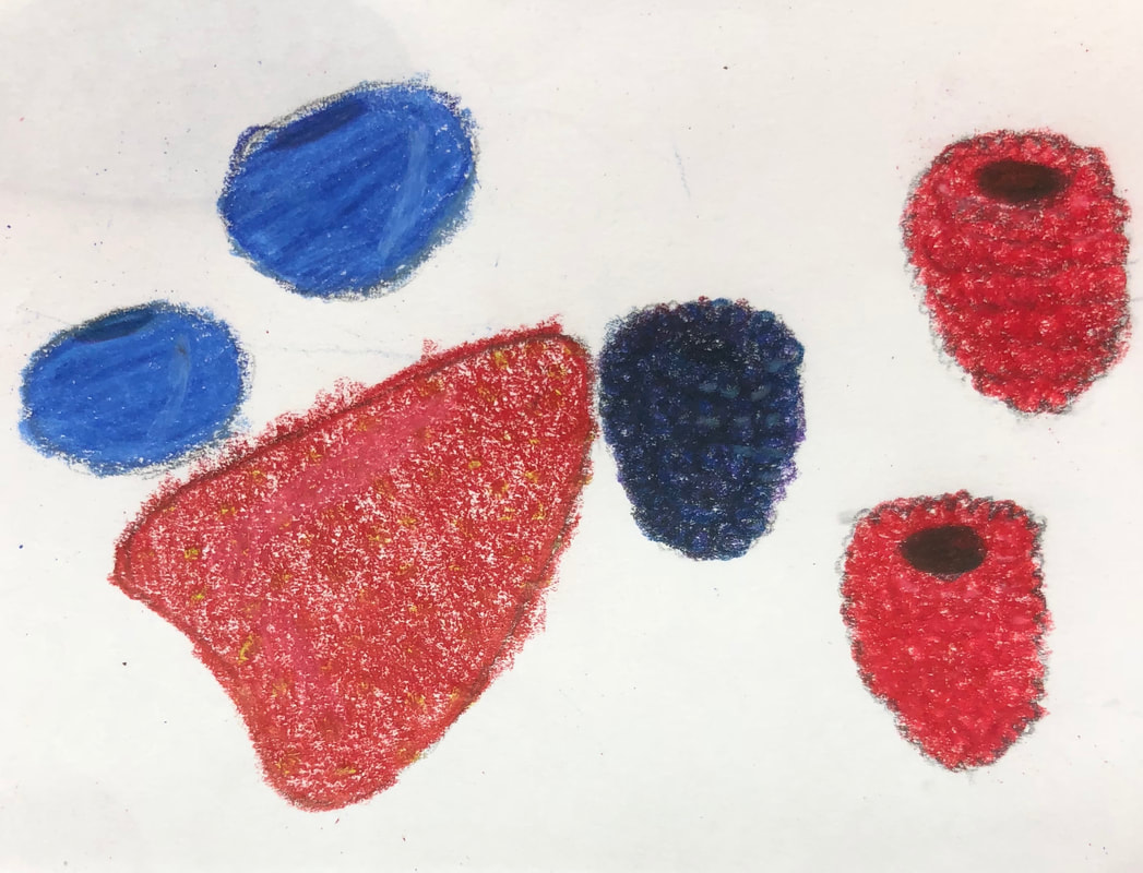
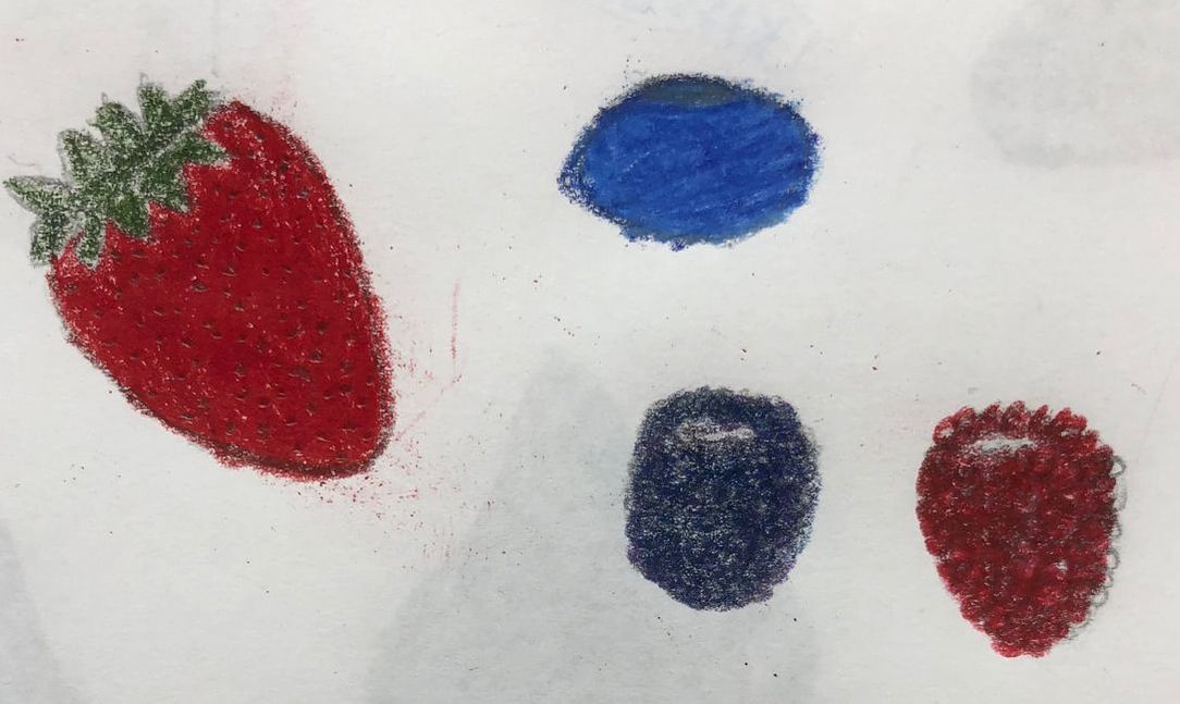
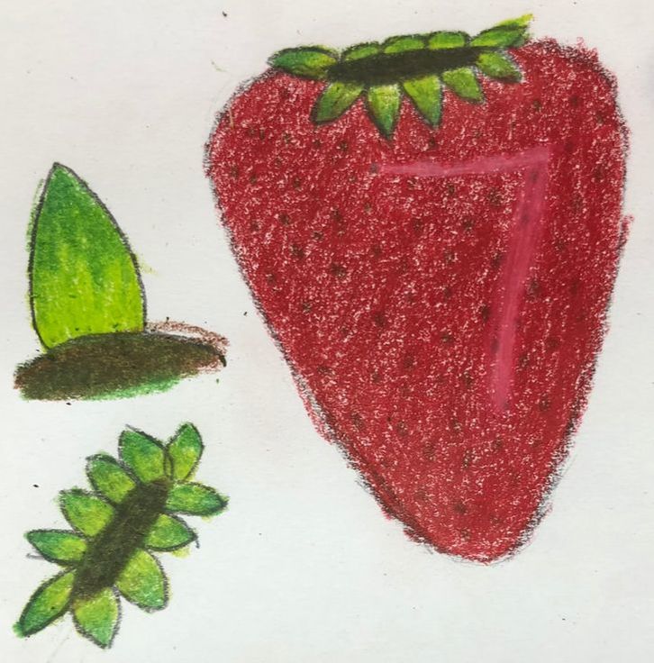
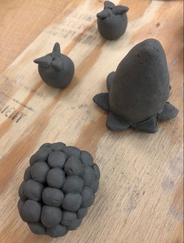
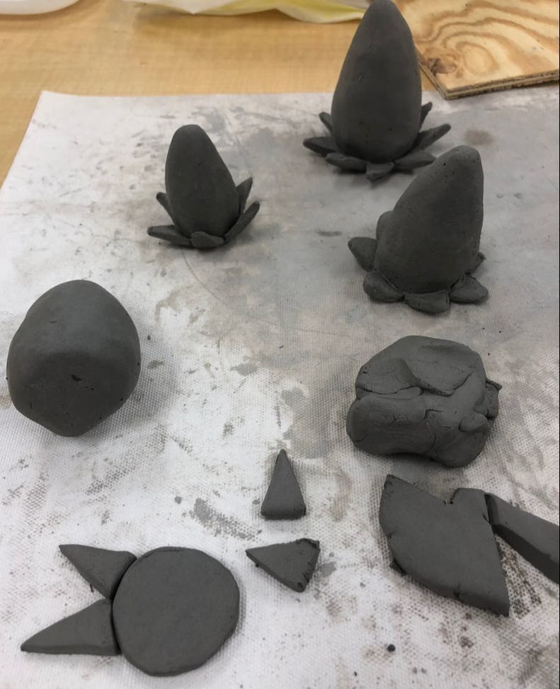
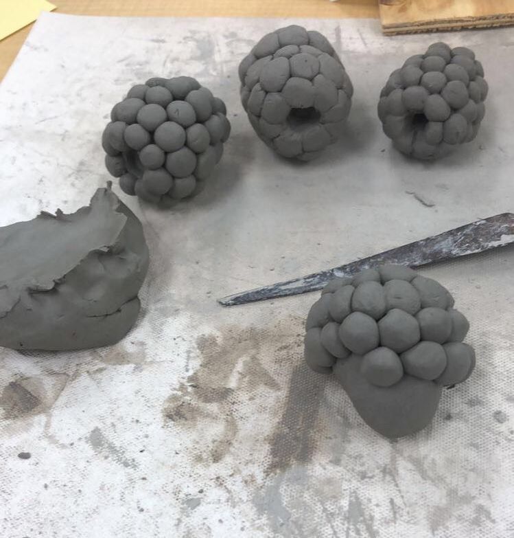
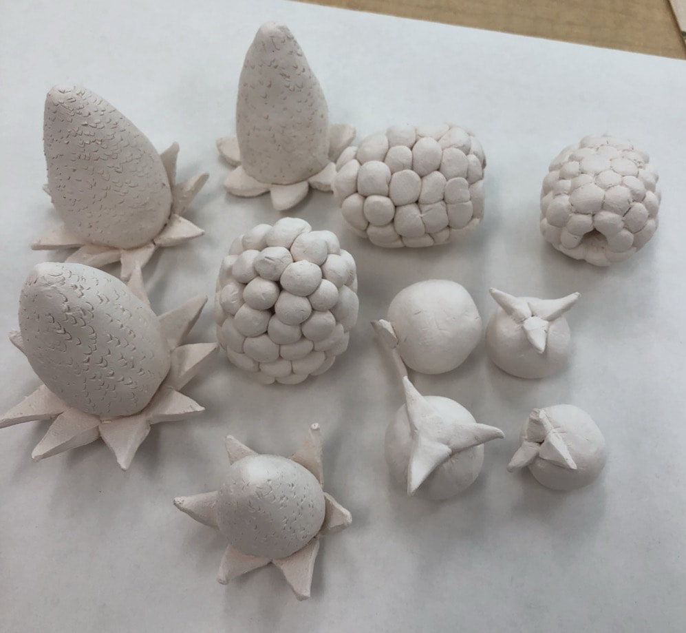
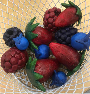
These are my in planning sketches. My plan was to make a basket of berries; including strawberries, blueberries, blackberries, and raspberries. I drew multiples of each berry to grow more comfortable with how each berry was shaped and the details that made each one special. I also colored all of them so when we glaze or paint the clay pieces I will know how I want them to be colored. Since each berry is special and unique there are very different ways you need to make them. For the strawberries I focused on the overall shape and the leaves since I thought those would be the difficult parts. For the blueberries I focused on the overall shape because I don't have a lot of blueberries so I needed to get use to it. For the raspberries and blueberries I focused on the texture because I still didn't know how I was going to create that until I actually had it. In progress pictures
These are my in progress pictures. On the far right you can see four berries done with the basics. There are two blueberries with leaves, a strawberry with leaves, and a raspberry or blackberry with the bubble texture. In the middle picture you can see the process of making a strawberry. There are three mostly finished strawberries, before the texture of the seeds are added. Then towards the right you see the strawberry itself and towards the bottom you see the process I used to make the leaves. In the far left picture you can see the process I used to make a raspberry. There are three completed raspberries and then one that's half finished. The base of the berry is poking out so you can tell that the texture is made from lots of little spheres. Final Artwork
Critique Questions
1. Describe the craftsmanship of your sculpture. (Is it neat and well executed?) I believe the craftsmanship of my sculpture is very good. I think the strawberries look the best. I eat a lot of strawberries, so I definitely know what those look like. That's probably why they were so easy to make. The colors I used to paint were also very realistic. I like my strawberries very much. The blue berries look good; I don't eat them a lot, so I don't know how they look very much. The colors could be more realistic, but it was very difficult to even get the color I did. For the raspberries and blackberries the plain clay part looks good, except one because the bubble things feel off, but the painting doesn't look as nice. It was very difficult to get in all the little crack and finding the right color was very very difficult. 2. What was the most difficult part of this project? The most difficult part of this project was definitely creating the piece with the clay. Clay is not my strong suit and it was relatively new to me since I haven't used it all a whole lot. Before this project I had a whole idea set in my head so I didn't really think I would need to write down what I was going to do, explain my plan. My plan didn't work as well as I thought it would so mostly I messed around with the clay until I figured out how to do what I was doing. It eventually all come together. Still it was hard to recreate something I already made continuously. I can't do that in most mediums, so having to do that in something I'm bad at doesn't end well. All the berries had to look the same, so I had to keep going back and fixing ones I've already made along the way. Anyway the most difficult part was creating the overall shapes of the berries. 3. Did your color choices work together harmoniously? The colors I used were very realistic, or I would like to think. These means that these colors occur naturally in nature, so it is normal to see them together. For example, the strawberry has a red bottom and a green top. These colors are found together in many places in natural, apple trees, poison berries. Also they are on opposite sides of the color wheel so they work well together. For the blueberries they are all blue so the shades and tints always work well together. This goes the same for the raspberries and blackberries. 4. Is your sculpture interesting from all views? I believe my sculpture is interesting from all different views. As I was creating this I looked at all the different angles. The only bad angle in the one that has the clay touching the table. It looks the same from all the angles because I didn't just look at one angle while making it. I looked at all the different sides. Berries are basically the same all the way around so I had to make sure that this sculpture looked good all the way around. There are parts of it that look flat because they had to rest on a surface but that part will be on a surface when it is presented. 5. Describe the differences in constructing a sculpture and doing something 2D. When creating a sculpture it's like making a real thing that you can hold and feel. It is a solid piece the you make with your hands. You can turn it over and look at the piece from all different angles. This means as the artist you have to make the piece appealing from every different angle, not just favoring a single angle. When making a 2D piece it is more capturing a moment in time somewhat like a photo. It's something you observe and you imagine seeing that scene happen with your own eyes. There is only a single angle you need to worry about; it is the way that you are creating the piece looking at it head on. As the artist you only need to worry about the one angle. 6. How did you create textures in your sculpture? To create texture I used multiple techniques. For the strawberries I made the piece really smooth first, then I used the tip of a straw to create the seeds around the strawberry. For the blueberries I made the pieces smooth because that's how blueberries feel. There are some small leaves at the top so I made those and then scored and slipped them to the piece. For the raspberries and blueberries I made a solid little berry. Then I made a bunch of little spheres and attached them all together on the berry so there was the bubbly like texture. 7. Does your sculpture look like the actual food? How did you accomplish this? I think the shape of the berries looks like the actual food. I accomplished this by doing looking at a lot of pictures and recreating sketches multiple times. The strawberries have there leaves on the top and the seeds all around. The blueberries are somewhat plump and have little leaves on the top. The raspberries have all the little bubbles around and the hole in the middle. The size on the other hand is not as realistic. Berries are a very relatively small food. To create all of the textures and little details I had to enlarge the pieces. Also the sizes of the berries comparing to each other are very different. There is one blueberry a lot bigger than all the others; there is also a raspberry a lot bigger than the others; and there is a strawberry a lot smaller than the others. 8. What would you do differently if you were to do this project again? If I were to do this project again I'd probably change what I was making. Don't get me wrong I really enjoy how my berries turned out, but I was planning on having more. I didn't expect it to take so much time for a single berry. If I were to redo this project I'd probably make something that was one thing like a cake or something along the lines of that, one single item. The problem with multiples of the same thing is that they all have to look similar. Some of mine are very different from each other but I still went back and kept changing things I already made to match the new one I just created. ArtistsWarhol In 1962 he exhibits his first solo exhibition, it is his Campbell's Soup Can. In 1968 he got shot by Valerie Solanas and almost dies of wounds; takes a giant toll on his art career, work output, and movement in general. In 1975 he publishes a book The Philosophy of Andy Warhol. In 1979 he helped find the New York Academy of Art. Warhol was a New York artist that drew on popular imagery and were part of an international phenomenon. Like main others he began his career in commercial art. His Campbell's Soup Can is considered on of the most important pieces of art in this period. This iconic series was never supposed to be celebrated for its style or form. This works became significant because of the ability to be universally recognized. Lichtenstein In 1963 makes one of his most famous paintings known as Drowning Girl. It appears as almost an exact copy of the DC comic Secret of Hearts. He only altered it very subtly. His career was defined by his experiments of the boundaries between high and low art. This raised many questions about originality and culture without reasonable answers. His works are very similar to the others of pop art, leaving the viewer the interpret the image. Whether the artist is applauding the image and cultural sphere it belongs in or critiquing it; it's up to the viewer to decide. Oldenburg He is one of the few American Pop art sculptor known for his crazy and fun creations of food and inanimate objects. He had collections of his work displayed in the Lower East Side of New York. These included Pastry Case and The Store. In these collections there were plaster sculpture foods such as a strawberry shortcake or a candied apple. He often replicated store items as art. With these he organized his works for a typical store at sold them at low prices. They were sold as there was a surplus, but he carefully hand built and planned every brush stroke on every piece. He combined the evocative expressionist gesture with the commodity item in a highly ironic environment. DefinitionsCeramics: art of making objects out of clay to produce pottery and sculptures
Clay: stiff, sticky kind of earth that is used in ceramics; it is wet, and it hardens after drying or heating Wedging: kneading the clay with hands to force out air pockets and create a uniform texture Pinch: a hand building technique which uses the fingers to gently pinch the clay to shape it into a bowl or other forms Coil building: a hand building technique, using the hands to roll out and rope shaped lengths of clay; the coils may be any size, but must be consistent with one another to build pottery; the coils are wrapped together on top of one another to form the sides of pottery Slab building: a hand building technique using rolling pins to roll out sheets of clay; these can be cut to form patterns and assemble into forms Score and Slip: a joining technique where the edges to be attached are roughened up and "glued" with liquid clay (slip) Slip: watered down clay (becomes soft and slippery) Kiln: a furnace or oven made of ceramic used to or "heat" ceramic objects; a kiln may electric, gas, or wood-burning and reach temperatures in excess of 2500 degrees Glaze: in ceramics, a thin, glossy coating fired into pottery or vases Plastic Stage: a stage when clay is workable, pliable clay Leather Hard: condition of raw clay where it has lost most of its moisture, but it is still able to be joined or carved Green Ware: pottery that has not been fired Bisque Ware: clay has been fired once in a kiln Earthen Ware (Glaze Ware): clay has been fired (low fire) a second time in a kiln In progress pictures
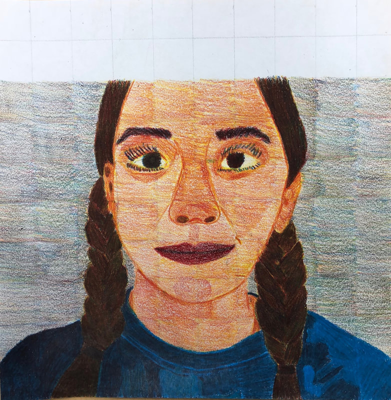
Final Artwork
Critique Questions
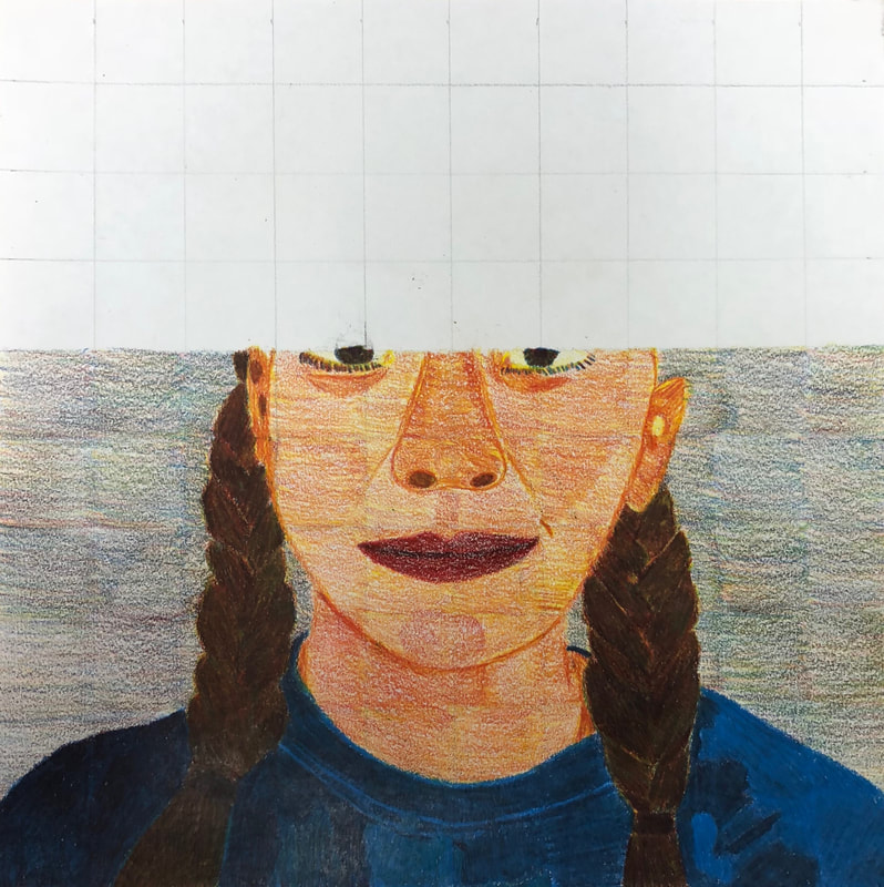
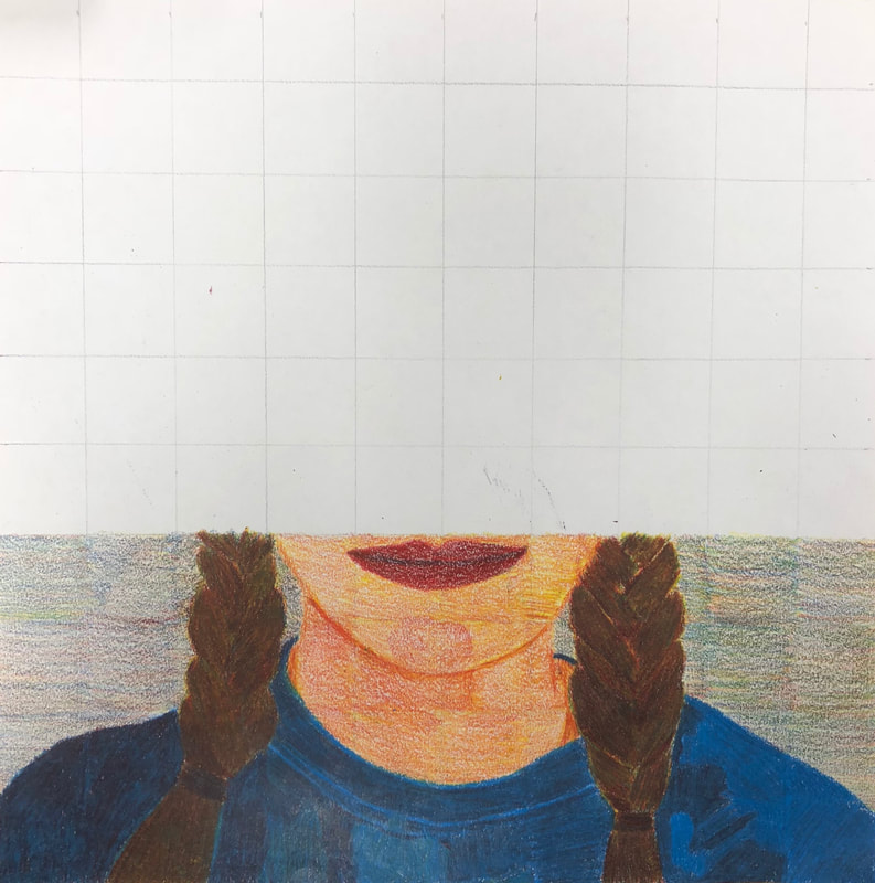
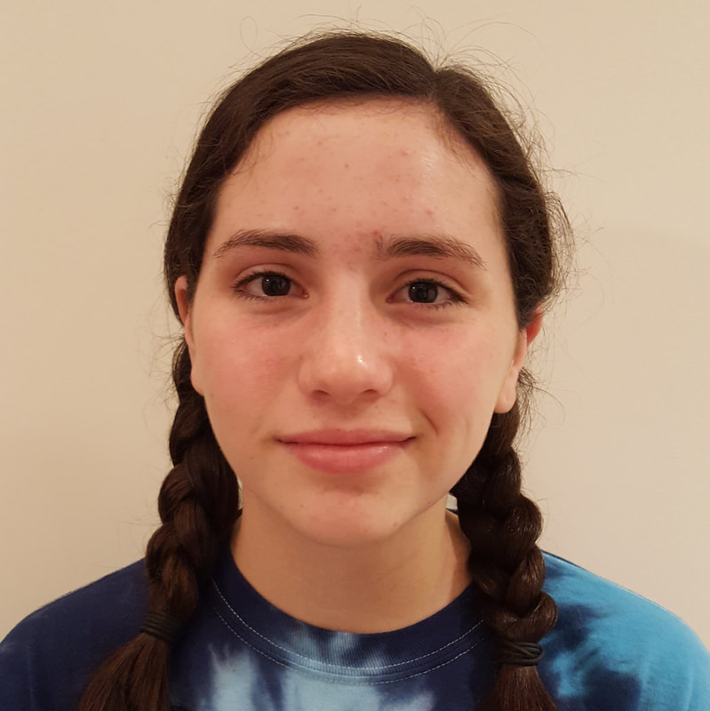
1. Describe the craftsmanship of your portrait. (Is it neat and well executed?) I feel that you can only go to a certain extent with craftsmanship in this portrait because we had to do square by square so it was hard to make it all flow into one piece. You can see that it was hard for me to make the background a solid color because of this. Also in the skin you can see the markings I made with the colored pencil, and that bothers me at least. The hair and shirt look very good and neat, probably because I had to burnish it to get the right color. 2. Describe any difficulties you had blending and mixing your colors. I had a lot of difficulty blending colors at least at the beginning. Eventually I kinda learned how to blend color better. I learned that you can't blend color with only two layers you need a third layer to blend the first two. I did that in the skin; my first layer was yellow then red and yellow on top of that. I still had difficulty in the skin because like I said before you can see the individual markings of the colored pencil which makes it look unblended. 3. Did you follow directions and draw each grid box separately? Why is it important? I mostly followed directions. I didn't do the eyes square by square and some of the hair I accidentally drew in the braid farther up than a square. There was also a couple times where there was such a small part of something in a square I couldn't color that small so I colored it with the square next to it so I didn't get stray marks everywhere. It is important to go square by square because then the face will be proportional and accurate because we also had a grid on the picture we were referencing. 4. How did you create value changes with your colored pencils? To create value changes I colored darker, like with more pressure, with the colored pencils to make it appear darker. I also put in some of the opposite color. Like in the skin shadows I used more pressure with the yellow and red and then I lightly put some blue on top of it. I only really had to create value changes in the face so that's the only technique I used to make value. As you can see in the chin and some what the nose you can see I lightly colored an oval red to make it look three dimensional and have more value. 5. Discuss how you were able to get the color you wanted from the three pencils? There were some colors I wasn't able to get how I actually wanted. Like there was some parts in the shirt that aren't actually right but they are relatively close. I made the shirt by making a very blue violet so it got darker. The hair I got from using yellow then red then blue and doing many, many layers. I took a while but it ended up working pretty well. I also ended with red and then yellow on the top; red because my hair is actually kind of red and yellow because it made it look a little lighter after I made it really dark. For the skin I never actually got a color I wanted I was just consistent with what I was already doing. 6. How could you improve your portrait? I could improve my portrait by having the ability to use brown and black. If I could do this the eyes would look a lot better along with the hair, so it would look more realistic. Also being able to use a skin color would help because then I would be able to blend the colors I already have and make it actually look like real skin not an elementary school trying to color. Being able to blend all of the squares would make the piece look all together and not all separated, so it didn't look like we drew it square by square. 7. Looking back do you feel you were prepared for this project? What part of the unit was beneficial in the success of the portrait? I was sort of prepared for this project. I was prepared in knowing what I had to do and having the materials. But I should've tried to create skin color before I started on the final project. That was my own fault because I had to choice to try it out but I didn't and I probably should have. Drawing the spheres was probably the most beneficial because it showed me how to blend colors without having to use a lot of pressure which was helpful when attempting to color the skin. 8. Chose another classmate's piece that you feel is an excellent example of mastering the techniques. Discuss why you feel this way. I feel like Amaya's piece looks amazing and is an excellent example of these techniques. You can see the all the techniques she used. Like in the hair I've seem her layering the colored pencil to make her hair look darker and darker to make it look more brown. Also her skin tone looks very realistic and blended very well. In the skin you can also see the value changes but it's blended so well it's not like super noticeable it just all blends together. Her background is like leaves and evergreen trees so it's fine that you can see the individual stroke so you can see the individual leaves. Also her jacket you can see the realism of the denim and how it gets lighter farther up because of the lighting.
In progress pictures
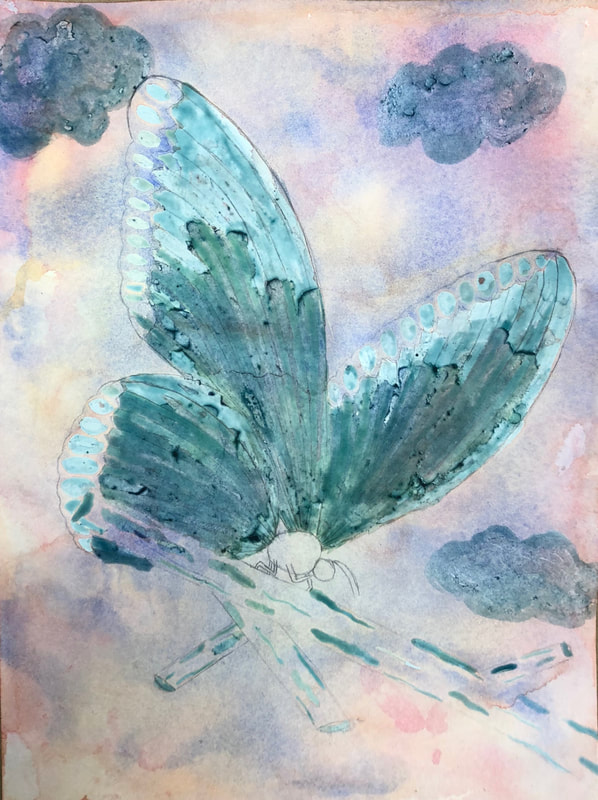
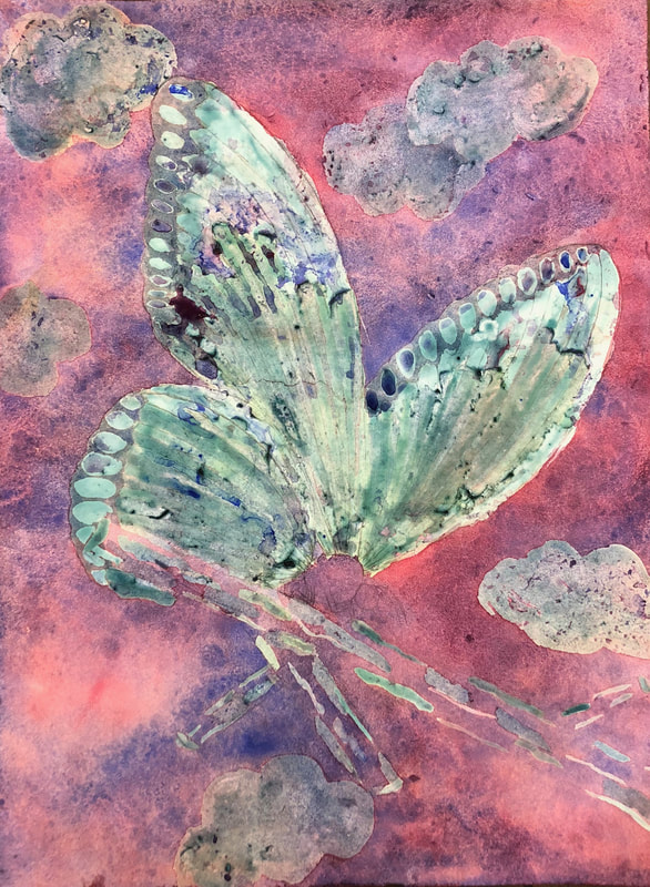
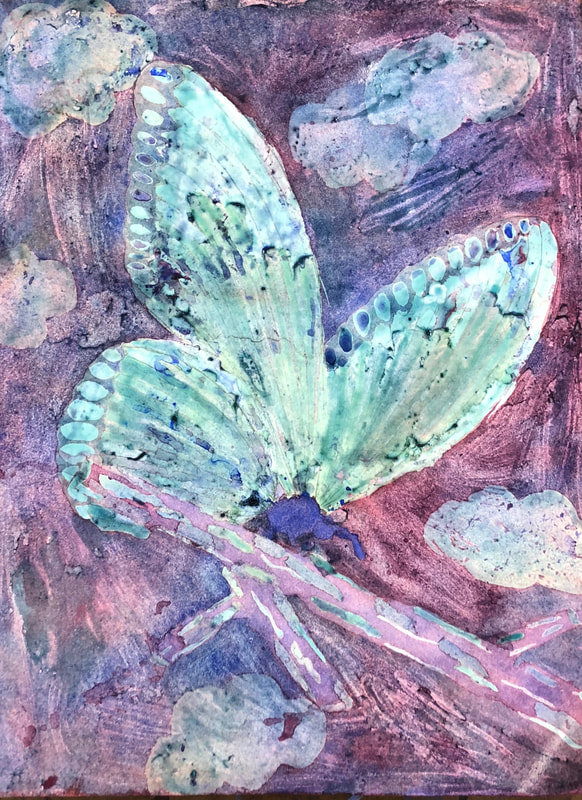
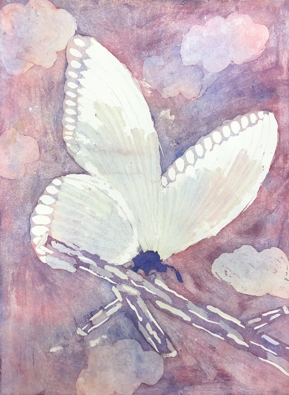
These are my in progress picture. They are what the piece looked between the layers, in between layer you put masking fluid to cover up the parts you want to keep that color. The first picture is after the two wing layers, with some highlights in the branch covered and a couple clouds in the sky. The second picture is after two background layers; one to make more clouds and the other for the rest of the background. The third picture is after the branch and body of the butterfly is colored; with most of the piece masked over, that's why it is so much darker. Final Artwork
difficult I had was using the masking fluid. This is a very new concept to me so it was hard to use since I’ve never used it before. Putting on the masking fluid was difficult because being precise was hard, also using the right amount. Taking off the masking fluid was also a difficultly because it was hard and boring to scrap off.
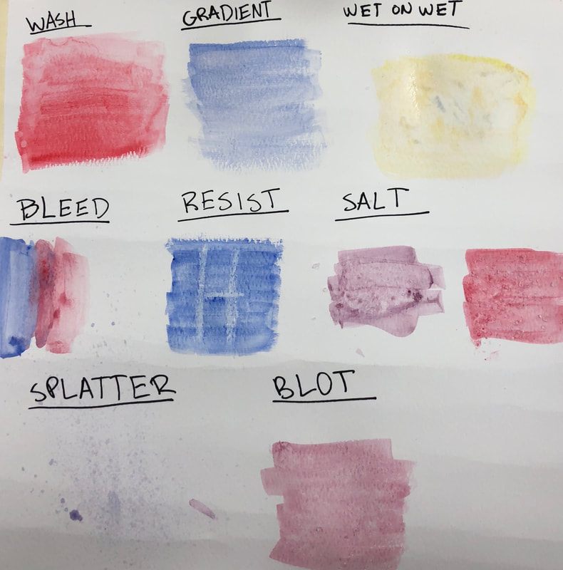
3.) What were four things you learned from this project? During this project one thing I learned was how to use masking fluid. Like I said before I’ve never used it, so by the end of the project I knew how to use it very well. Another thing I learned was that sometimes you just need to walk away. Eventually in watercolor you just need to stop and not continue to try and perfect it, I think I picked the perfect time to stop in my piece. I also learned how powerful colors can be and how they mix. Since we were moving all the colors around the whole paper this was an important concept. I had to know how much off each color to use so it wouldn’t turn out brown but full of bright colors. The last big thing I learned was how important value is. In this project you didn’t really plan out where everything was going to be, so I had to use my knowledge of value to create different layers in the piece. 4.) What would you do differently if you were to do this project again? If I were to do this project again there isn’t much I’d change. But something I would change is being more precise with the masking fluid. To make some things less bloby, like the antenna on the butterflies body. Or like the little part of the butterflies wing that appears under the twig. One more thing I would do differently is plan out the background more. During the sketch I left the background all one solid color because that’s what I thought I’d do. But I ended up really liking some parts of the sky so I covered them with masking fluid. I didn’t really know how to, so I ended up making really cartoony clouds. 5.) How did you use layers, texture, and color to create a successful piece? I used a lot of layers because I had to create value. The beginning layers I used to create the pale color of the butterflies wings and make highlights and shadows in them. I also used layers to create cloud in the sky along with highlights in the twig. I used texture to create the background. The color wasn’t going where I wanted it to, so I used my finger to move it across the piece. I didn’t purposely create texture it just kinda happened, but I really enjoy how it turned out. I used color to create contrast between the foreground and the background. The foreground, the butterflies and it’s wings, is more green tinted. While the background is more purple tinted. 6.) Do you feel the mini watercolor lessons were beneficial to you learning more about watercolor? Explain. I think the mini watercolor lessons were very beneficial to me learning more about watercolor. Because we learned various techniques and how to create value. But these lessons weren’t used as helpful in the final project because it was a new technique for all of us. It originally wasn’t going to be our final project so we were going to use the techniques and the things we learned in the final project. While continuing the art classes throughout high school these techniques will be helpful since most likely we will use watercolor again. 7.) Was having a guest artist a positive experience? Explain. Yes, having a guest artist was a very positive experience because I learned so much. I learned that there are a lot more techniques to create a lot more different kinds of art. I also learned that you could actually make a very decent living from art, and a lot of other people do it too. Having a guest artist was good it introduced different ideas of art. Different things that I didn’t even imagine you could do. It also enhanced our experience with watercolor because we saw how a professional artist can create a lot of pieces with watercolor. 8.) What did you learn from the guest artist that gave you more insight into being a professional artist? I learned that you can make a good living off of being artist. When I was little I always said I wanted to be an artist but my parents tried to turn me off that path because they said it doesn’t make good money. From seeing this artist I saw that you can actually making a living off of being an artist. Also it showed me that you can make a living off of what you love to do. That it very inspirational because in life everyone wants to be happy and have a job that they don’t hate. Now I see that you can create a job with your passion and live off of it.
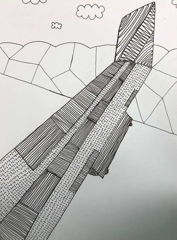
Planning sketches
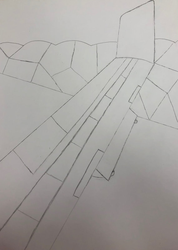
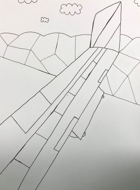
In progress photos
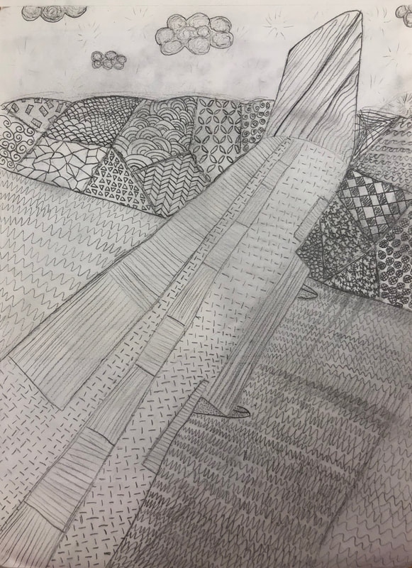
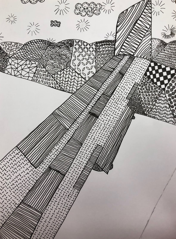
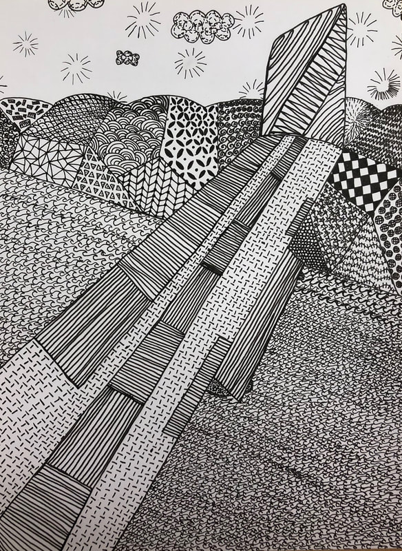
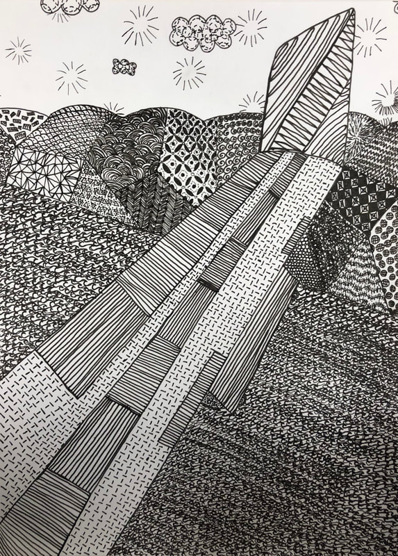
Final Artwork
8.) If you could recreate your piece what would you do differently to enhance your final outcome?
If I could recreate my piece the first thing I would do differently is in the wing the horizontal and vertical I would make those farther apart so they were lighter. Next I would probably find more reference pictures of the hills in the back, that was hard to do. The hills in the back turned out better than I thought they would but there is always room for improvements. I also would find more reference photo for the run. While that wasn’t that difficult I would like to make it look more realistic because right now it looks like a flat road and not real or three dimensional at all. |