0 Comments
Final Piece
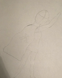
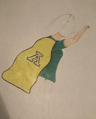
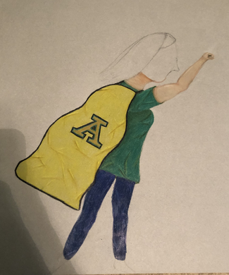
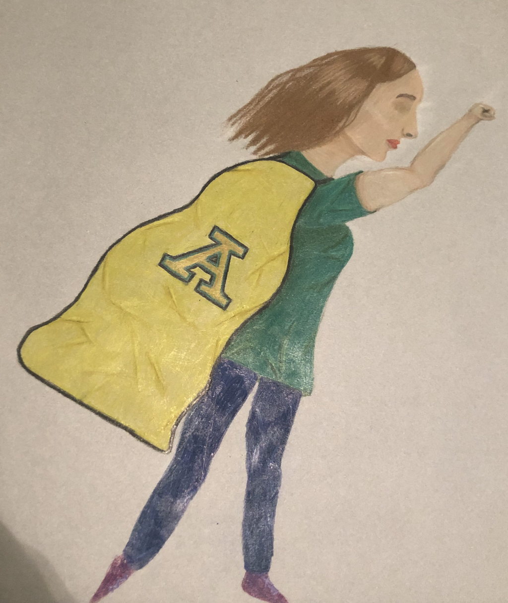
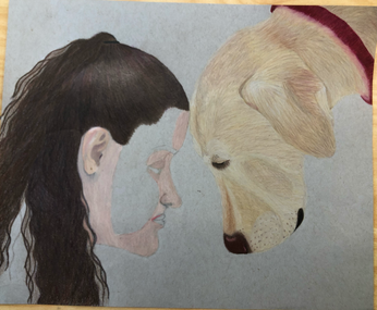
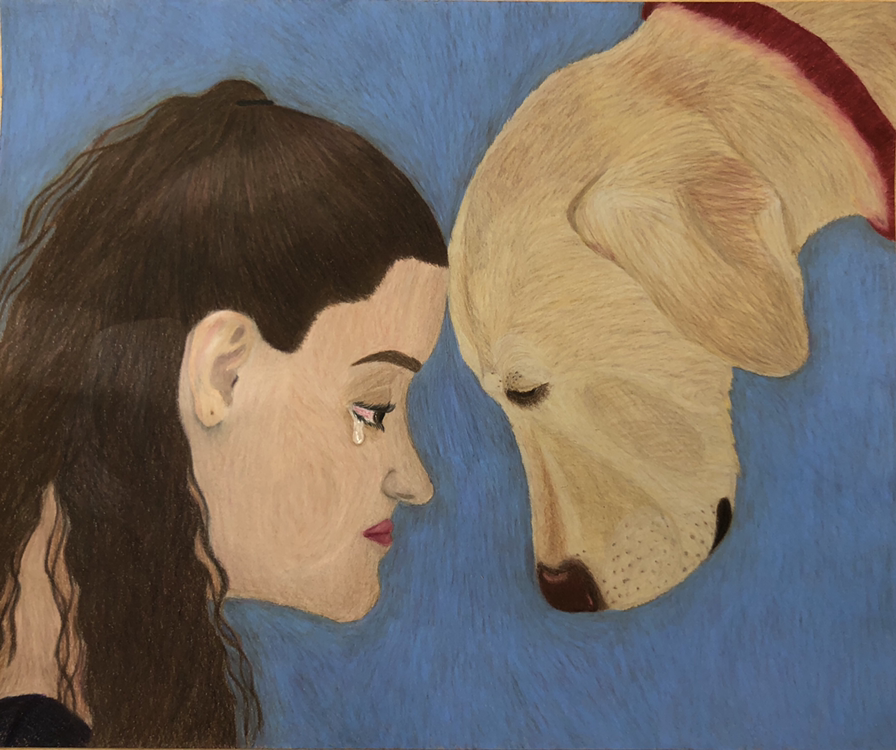
couple issues. As you can tell from my in progress pictures, I did the face last. This wouldn't be an issue if I actually drew in the face before I started in the first place. When I got to the face, I drew the profile, but the space between the hair and the neck was to long. I ended up making the neck to long, so then I went back and made the shirt collar come up a bit farther. In the end you can't tell that I had some issues around there which is great.
4.) When someone looks at this piece I want them to notice that there isn't much individuality. I made it like that on purpose because then every teacher that looks at this can imagine themselves as a super hero. There is color to the hair, but it is an in between of blonde and brown. There is no eye color, and there isn't much detail to the features at all. I want to viewers to see the cape and see how it is on an ordinary person, and I want them to think that they can be super too.
Final Piece
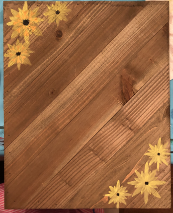
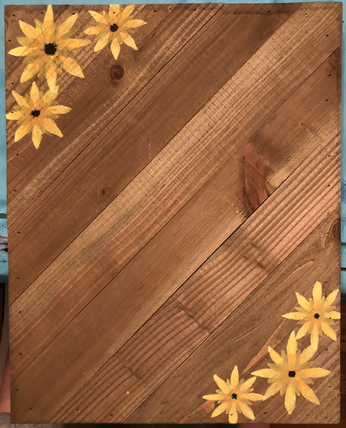
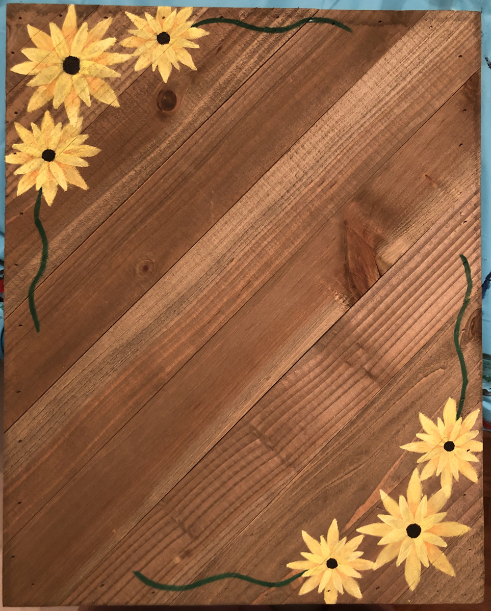
the green squiggles, but I scratched that idea because I thought it would take away from the flowers. Also, I don't have many different shades of green, so they wouldn't look very good. I believe this improved the final piece because it makes the flowers stand out more as I intended.
4.) I want the viewer to notice how the petals are different from each other, in the different layers. I want the viewer to notice that not all the flowers look to same, yet they are still all breath-taking in their own way.
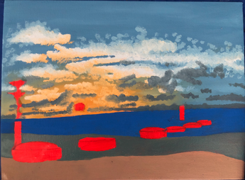
Final Piece
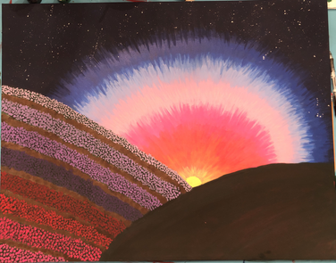
messed with all the different aspects of this piece. The sky I continually touched up during the process. I ended up putting a blue tinted wash to make the warm colors less vivid. The flowers I enjoyed a lot, so I didn't do as much for them. However, for the field on the right I had three different shades of grass to add some value, and for the field on the left I did the same but with the dirt.
3.) The biggest problems I ran into during this piece was how bright the colors were. Because this piece is made at sunset the colors shouldn't be that bright. As I said before I put a blue wash over the sky to make it all more connected and less vivid. For the blanket, I wanted to use the basic white and red checkered pattern, but the colors were very bright. I ended up mixing the two colors with more or less green to create the highlights and shadows of the piece. 4.) I want the viewer to notice how small the blanket blanket is in comparison to rest of the piece. This symbolizes how small and unnecessary humanity is compared to the rest of the world. Humanity is unimportant because we are messing up the environment and without humanity the world would be this big, grand, beautiful thing. Because I am bored in quarantine, I decided to make a post for all of the little crafts that I decide to do.
Final Piece
Questions
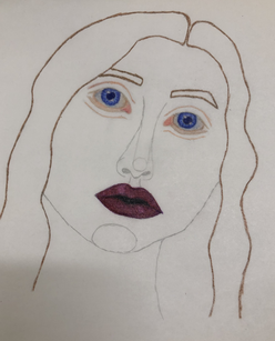
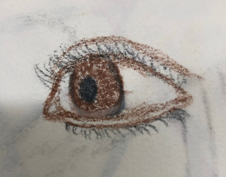
1.) I mentioned before that I planned for this piece to be much different. While making this piece, I used tracing paper and prisma colored pencils. I started with just the eyes and the lips, and since I liked how that looked so much I changed my idea to have to face look more realistic. Once I changed to that idea I worked my best on making the rest of the details realistic. 2.) My artistic choice to use colored pencils helped greatly because of the wide variety of colors. The idea behind this piece is that her mind is dark and while you can't see that on the surface you can hear it in the way she speaks. The rest of the piece is light, including her skin, eyes and hair, while her lips and the paper behind is dark. I believe the media I used helps improve the impact of this metaphor. 3.) Once again as I said before my original idea was much different. Originally, I was going to make multiple less realistic faces overlapping to show the difference between people. Yet, I liked this one face so much I changed it to show just how one person can be different within themselves. I think it looks really good in the long run because of how great it turned out. 4.) In this piece, I want the viewer to notice the difference in the colors. I want them to see how much darker the lips and mouth are from the rest of the piece and how the under paper is black and matches the mouths dark color scheme. I want them to notice how the face is so much lighter and the eyes are light and look like they hold something other than they contain. I want them to notice her expression, and what it means to them.
Questions
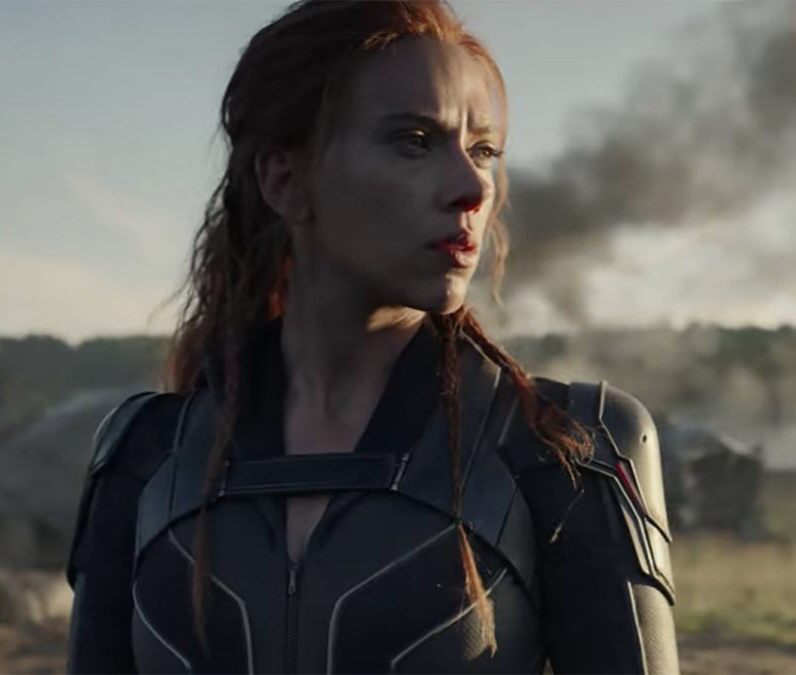
1.) For this piece I didn't really do much planning. The photo is a snapshot from a video I had to watch multiple times for one of my classes, and since I really enjoy the Marvel universe and am extremely excited for this movie to come out, I decided to draw an iconic part of the trailer. I really just remade the photo as best I could to practice drawing from an image. 2.) I used prisma colored pencils for this piece, and I feel like the fact that it was in color really made the image more iconic. Natasha Romanoff is well known for her iconic red hair, so I feel like if this was done in black and white it would not have been as well recognized. The technique I used involved more lines, than circles, so it helps add more shape to her figure. Of course, the shading creates depth and helps create the figure, but because of how the lines follow her figure and features it helps emphasize the shape. 3.) One of the big problems I came across was the fact that her outfit was different shades of pure black. To solve this, I used less pressure and ended up not burnishing the entire outfit because could only use black. Another problem was the dramatic shadow across her face. Skin color is already quite difficult to get, but having to add in more dark blues and purples to create the shadow made it even more challenging. In the drawing the shadow is not as dark and dramatic, but there is a very noticeable difference between the light and dark sides of her face. 4.) I want the viewer to notice that this work is an iconic snapshot from the Black Widow trailer. With the combination of the long red hair with small braids and the new black less exposing outfit, I feel like fans will easily be able to tell that this is Natasha Romanoff straight from the new, official Black Widow trailer that will be in theaters May 1st.
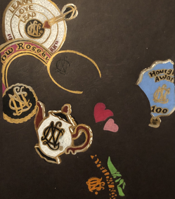
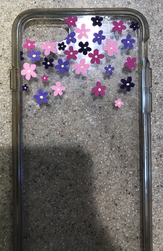
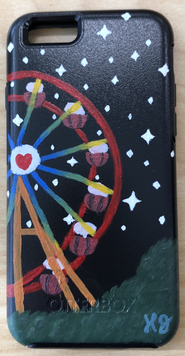
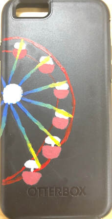
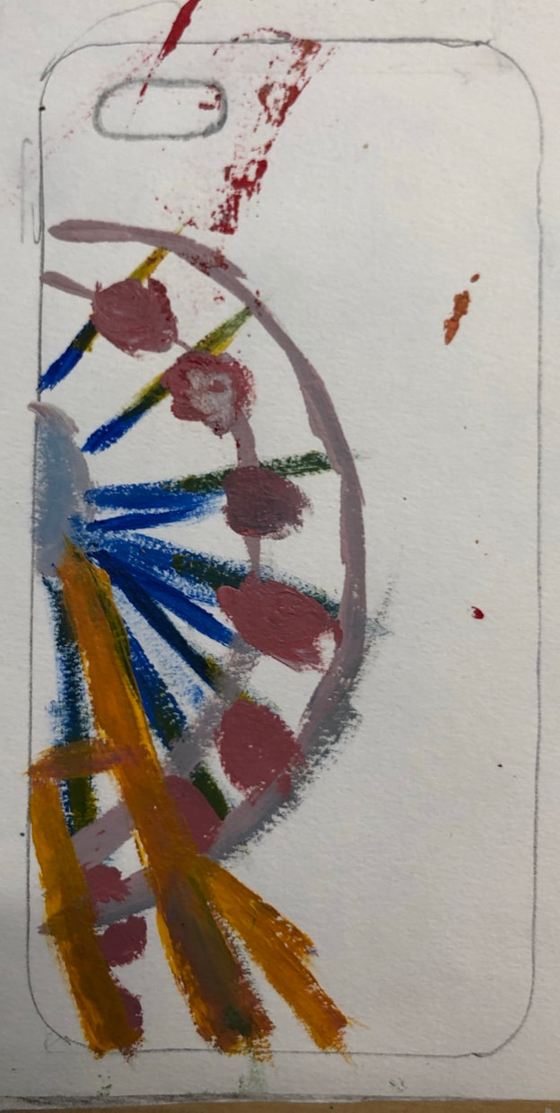
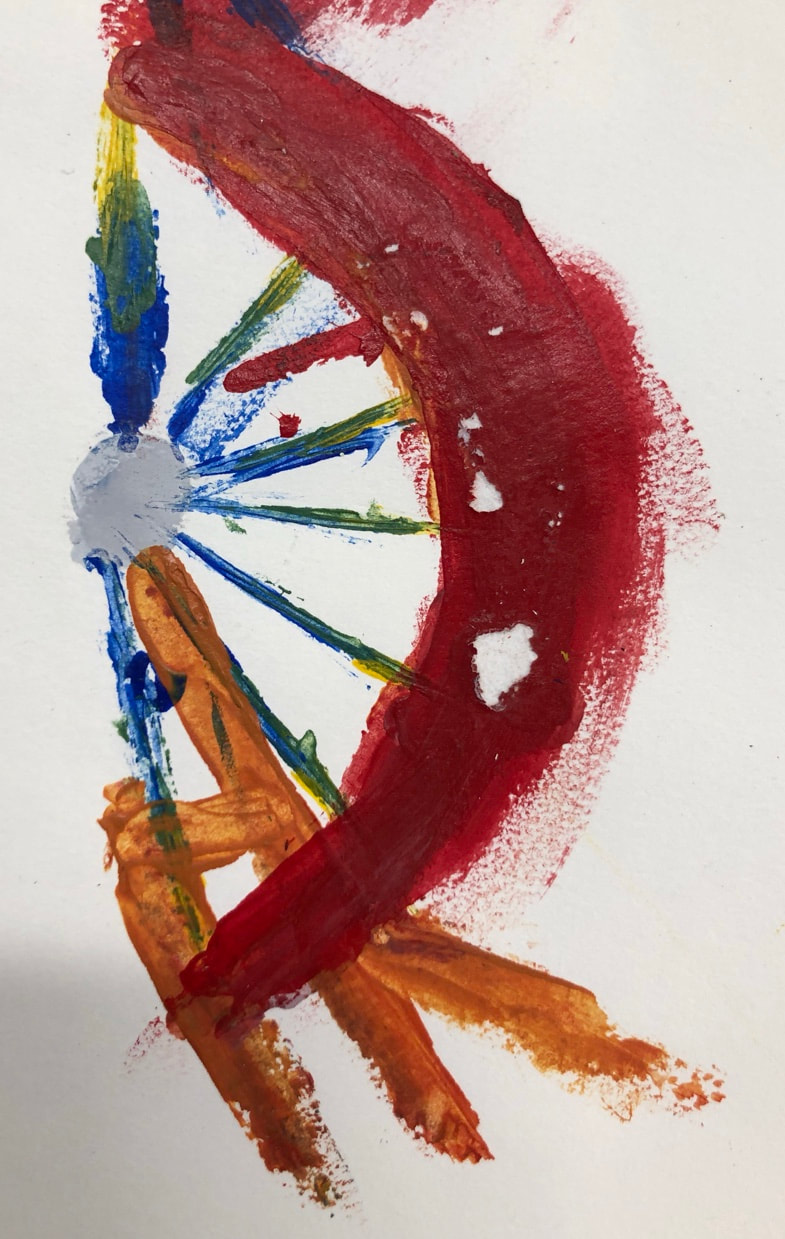
This week I started working on a gift for my boyfriend for Christmas. Our first date was at the fair and we rode the Ferris wheel. I bought a phone case and painted a Ferris wheel. I really love the colors and how they all blend together; it's all coming together and I am really excited. On the left is the current picture and on the right is some planning.
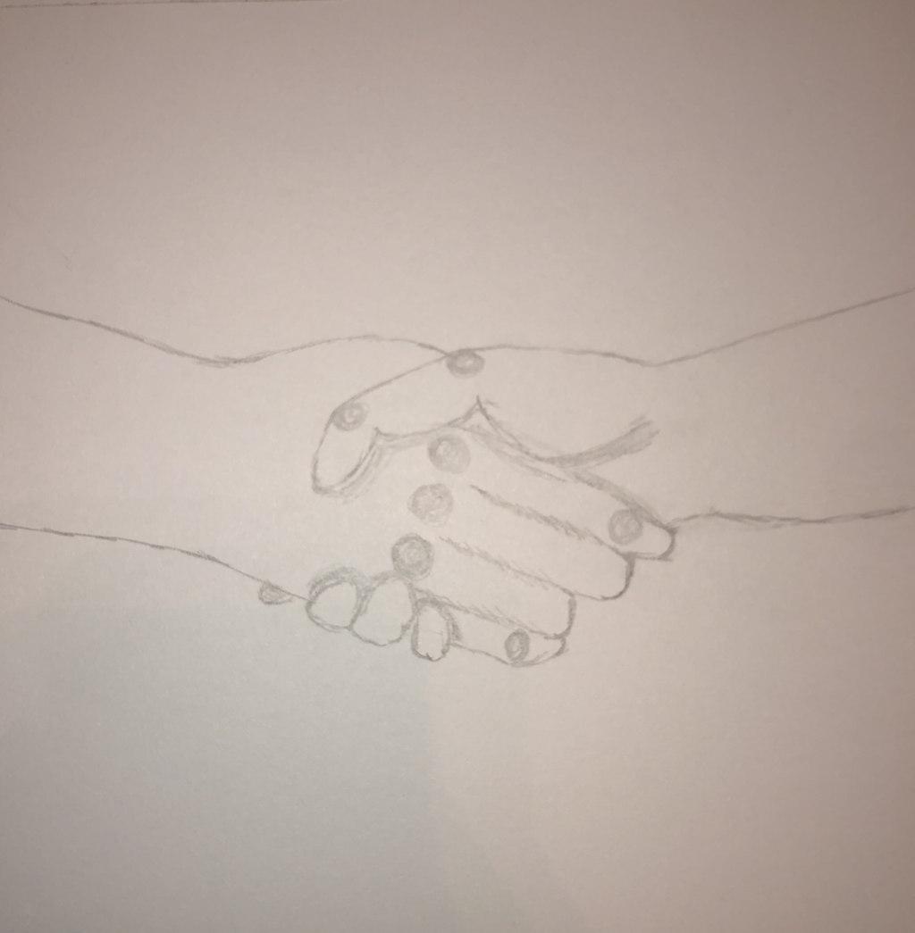
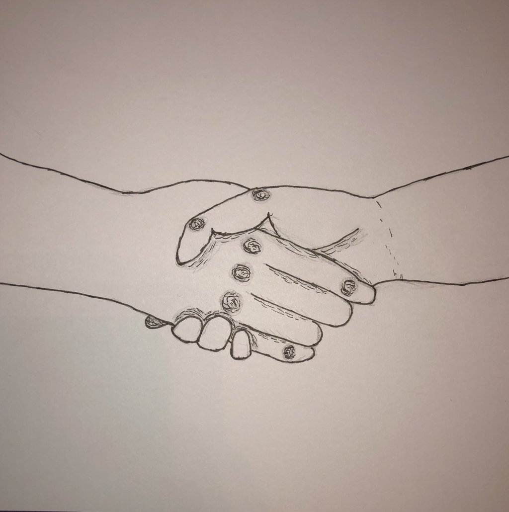
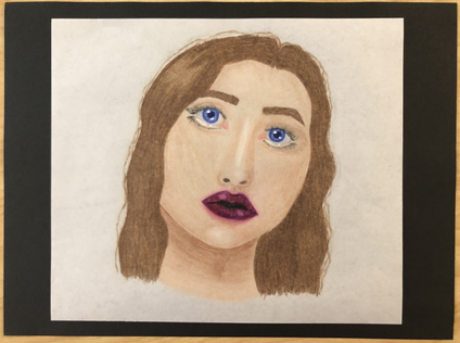
These two weeks was only a total of six days, so I just decided to combine them together. All I did this week was work on and actually finish the piece I've been working on. I'm really happy with how it turned out. You can see all of the details because of the background I used. I spent a lot of time on this piece and I am very proud of how it turned out.
|