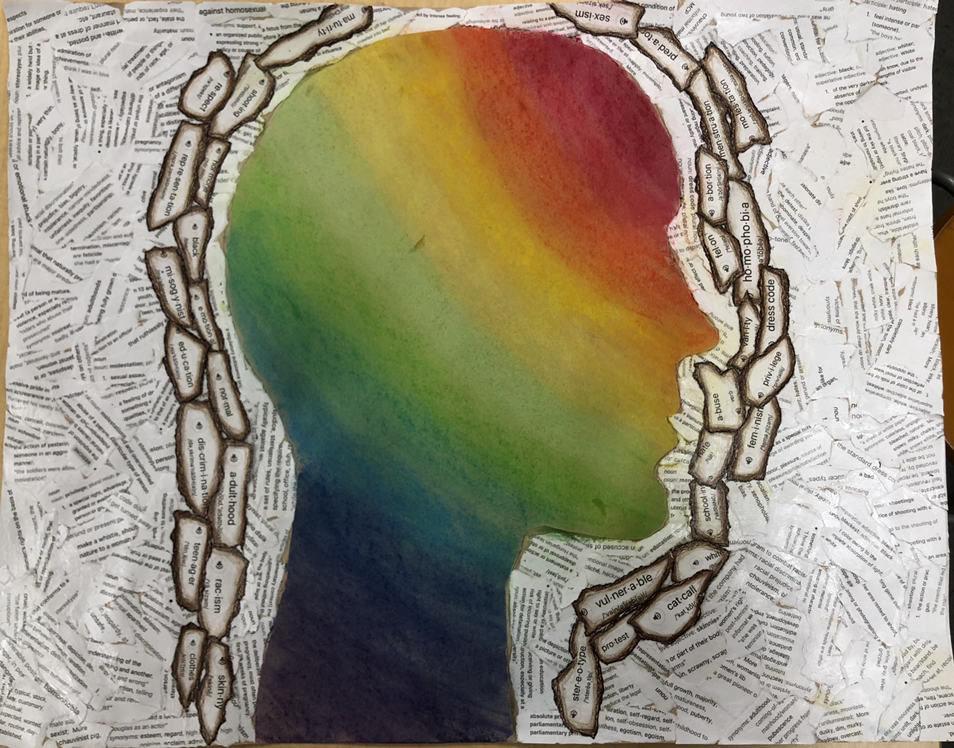
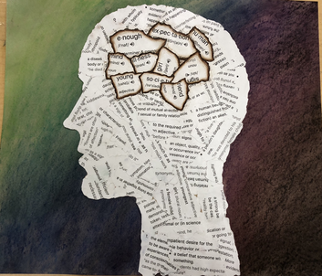
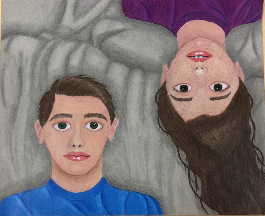
These two pieces weren't originally a series but they became one because of the similarity between the two. I actually did the one of the left first. It revolves around the idea of what a young girl is suppose to be. It symbolizes how it has consumed her thoughts while trying to be this perfect daughter. The background reflects how it gets darker the longer you are controlled by these thoughts. The piece on the left shows the problems of the world and things girls have to overcome and they get older. In this project the definitions are in the background instead, this shows how it is the outside world that is effected. The words create and border or a shield symbolizing how the girls are protected when they are young, but as they grow old that shield has diminished. The bright colors on the inside of the head reflect how naive girls are at a young age.
0 Comments
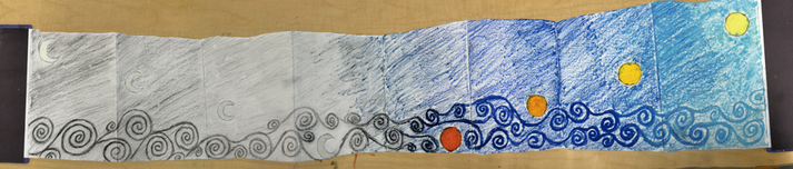 If we're being honest, I did this because of one of our Friday activities. We were suppose to make an accordion book. I did mine about how things can go from deep and dark to light and bright. I used charcoal, graphite, and oil pastel.
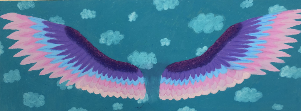 This project didn't have a theme it's just something I wanted to do and experiment with. The idea is that they are angel wings that are flying up to heaven. The wings go through a value change of dark pinky purple to a light shade of pink. The colors don't mean much besides the fact I liked how they looked. The background is just the sky with clouds. Again, the reason for the green color is just the fact in creates contrast between the wings. I like how this turned out, especially considering I don't have experience in this medium.
|