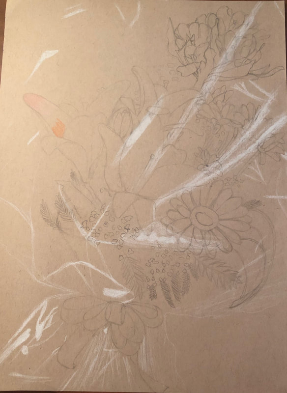
Planning Sketches
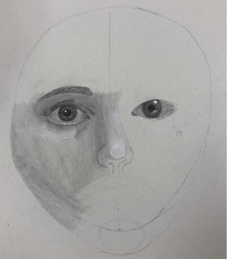
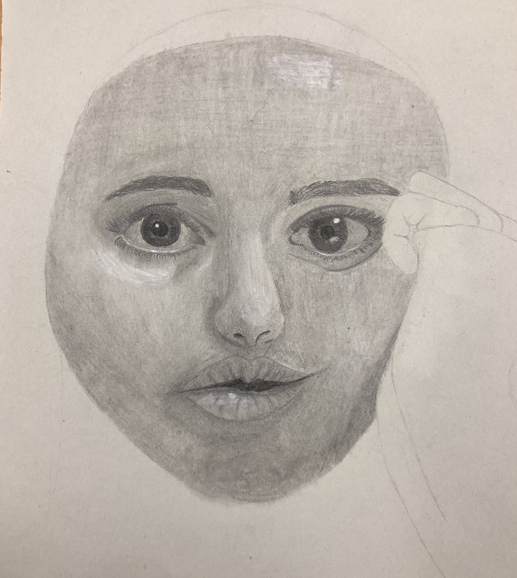
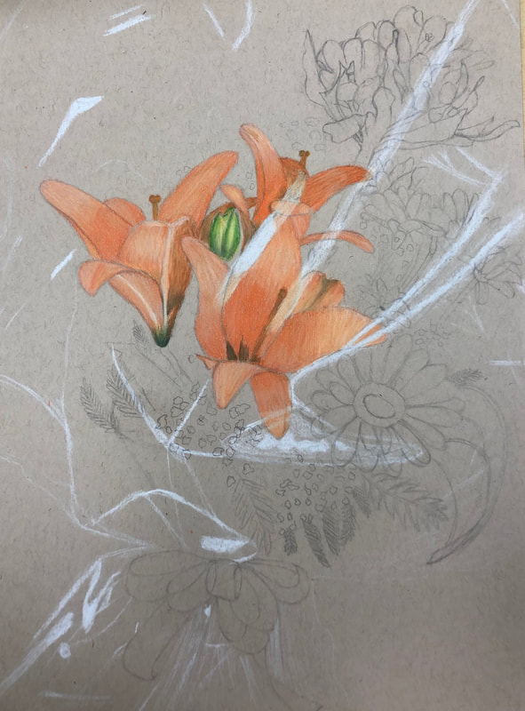
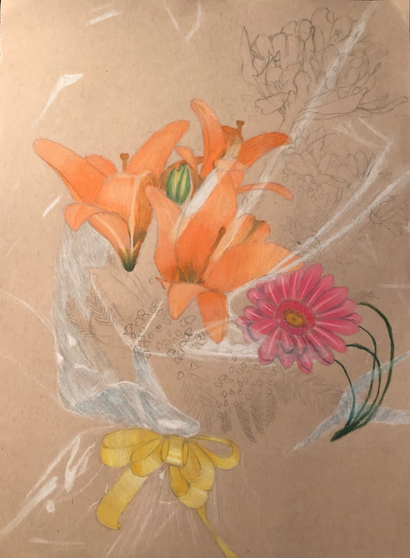
In progress pictures
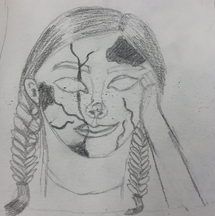
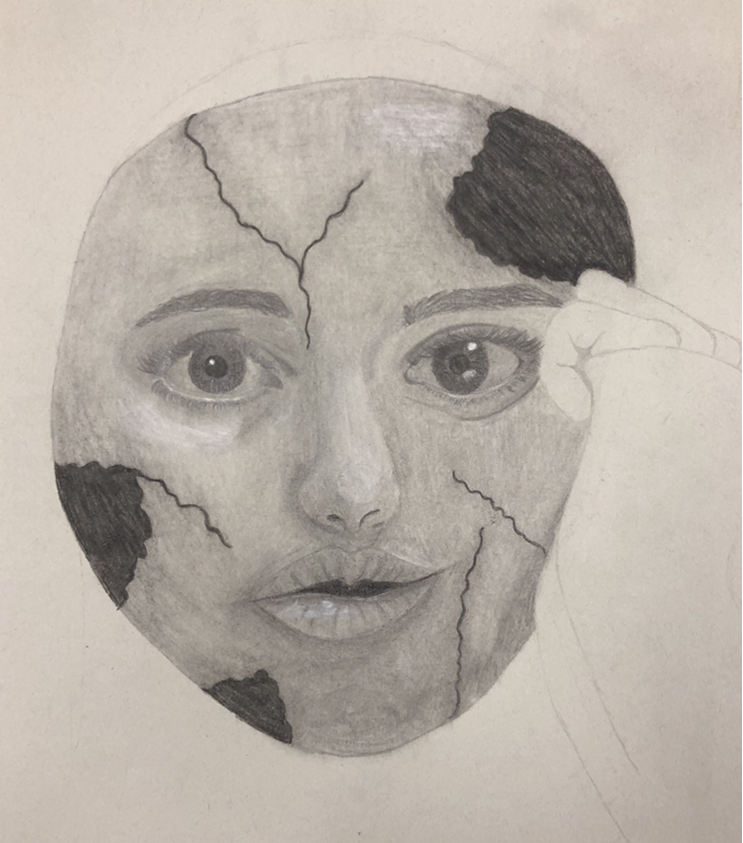
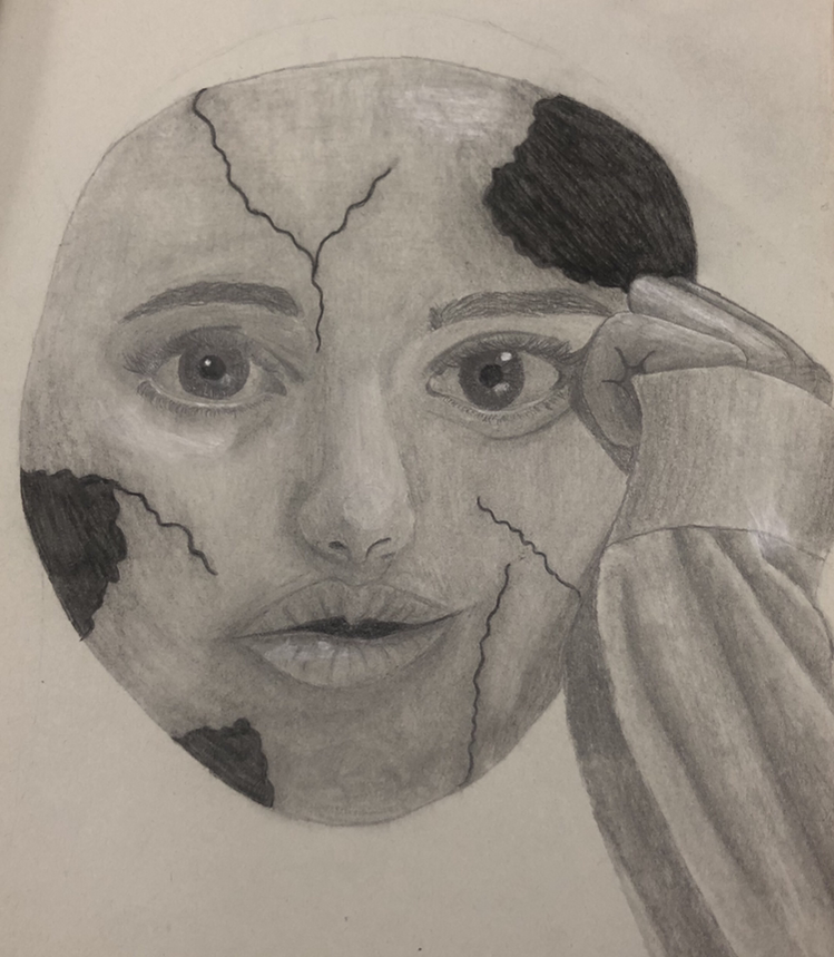
Final Piece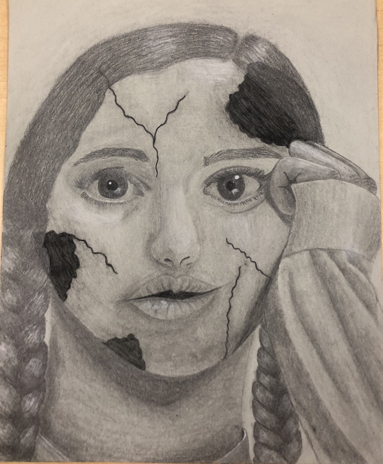 Critique Question
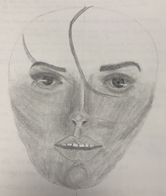
1. Explain the process you went through to develop your drawing. When we were first given this assignment right away I had this idea, so it wasn't difficult to come up with it. While creating the piece I kind of just went in a random order. I just did things when I wanted to. For each like part of the face first I sketched it out and then added value. And finally blended it to make it look all smooth. 2. Explain how you found the different values in the portrait? Obviously I had a lot of value in this because it's a portrait and most of the face is just created from value. Since I tried to have the porcelain doll look so I tried to have it look paler and a little brighter with the black broken spots. Still I found values in the natural darker parts of the face and of course the shadows created. 3. Did you achieve a full range of the different values within your portrait? How? I created a full range of value by using all the different types of pencils and using the blending stump to blend them together to get a smoother transition. I made sure to very to value so there was a difference in each feature. Sometimes I had to go back and make it darker or pull up some graphite. 4. Describe your craftsmanship. Is the artwork executed and crafted neatly? I think that my artwork is very neat and well executed. Normally when I used graphite it get everywhere all of the paper, but it didn’t this time. I didn’t change anything so I don’t know why. This project probably looks the neatest because we were aloud to use a blending stump instead of just the pressure of the pencil. 5. How were you able to capture your look? I continuously looked at my reference picture, so I was going off a real picture of myself. Like I said before I also made the overall values lighter to have more of the porcelain look. I didn’t have dramatic highlights, but I didn’t want it to look fake. I wanted more of a realism look which I believe I accomplished. 6. Explain how you made sure you had correct facial feature placement. I didn’t really continuously make sure they were placed correctly, but at the beginning I used a piece of tracing paper, to use the eye as a measurement, and sketched the correct area for all of the features. I also redid them multiple times so they were correct. Together I used the measurement placing and just how it looked better to make the piece more visual appealing and correct. 7. Explain the importance of learning how to draw all the features individually. Each feature is important and you need to treat them that way. So by learning separately you can focus on it when you learn the specific feature and master it before putting it on a face. If you learn them all together you’d just get so lost trying to do all of it like at once. When drawing you need to take your time and work on one piece at a time. 8. What part of this unit was the most beneficial and why? I think this whole unit was beneficial because I learned a lot and grew as an artist the most this unit. If I continue in art most of my drawings will be of faces because that is the kind of I like to draw the most. Specifically, I think the videos of the dos and don’ts were the best because it showed how most people do it but how that’s wrong. 9. List any obstacles you had to overcome and how you dealt with them. Definitely an obstacle was having to continuously look at a picture of myself. I don’t like looking at pictures of myself, so having to look at one continuously was a struggle. Another obstacle was trying to get all the values correct. Without going to light and not noticing the value or going to dark and exaggerating the shadows to much. I really just did it and hoped for the best. Then I just went back and tried to make it look more realistic more appealing.
0 Comments
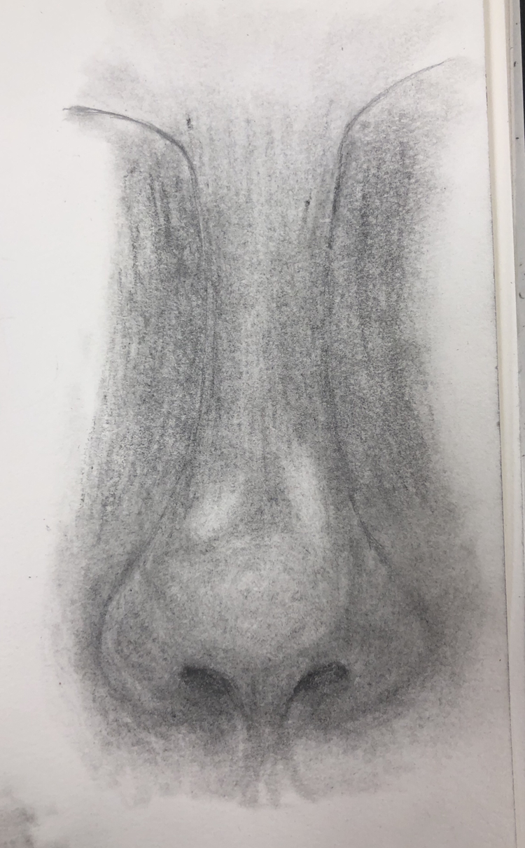
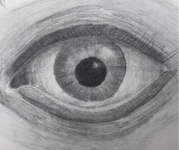
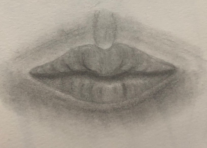
Eye, Nose, and Lip Drawings
Face with All the Features Together Drawing
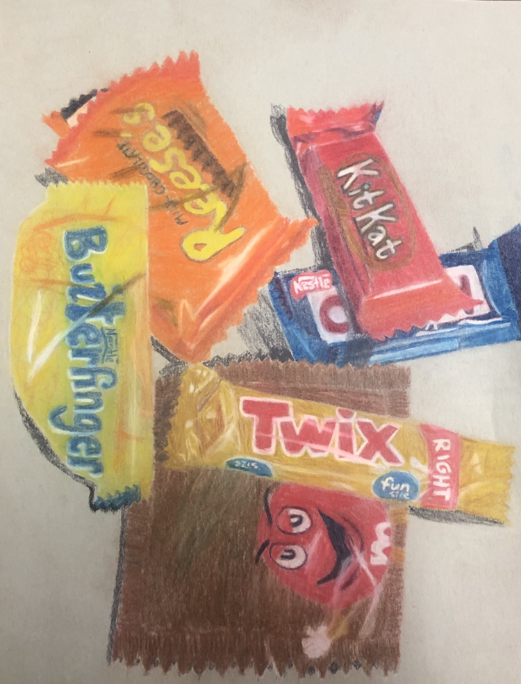
Candy Drawing
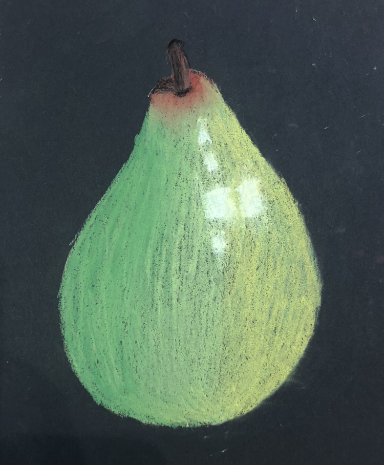
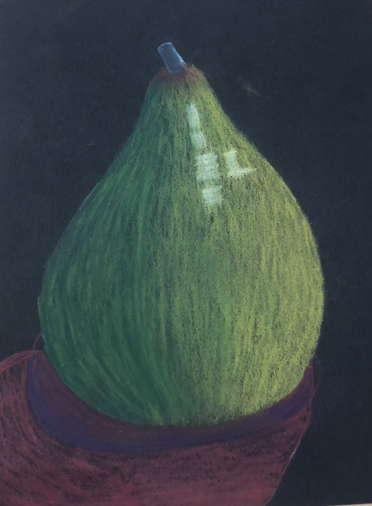
Fruit/Veggie Drawing
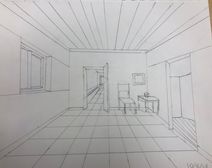
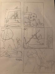
Compositional Sketches
In Progress Pictures
Final Piece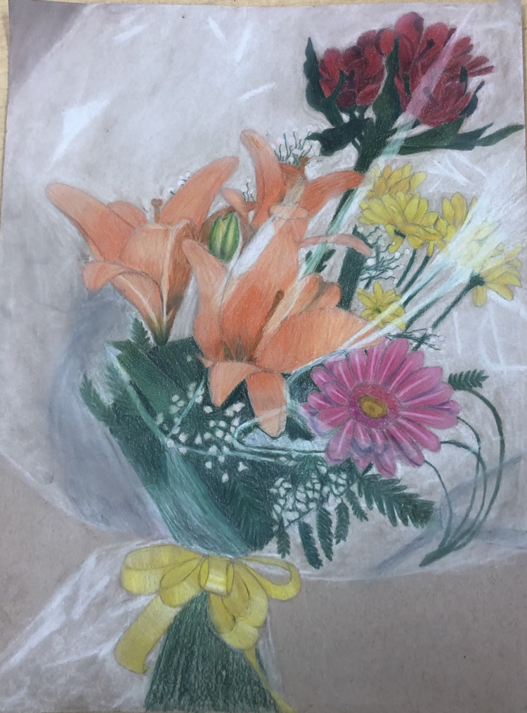 Critic Questions
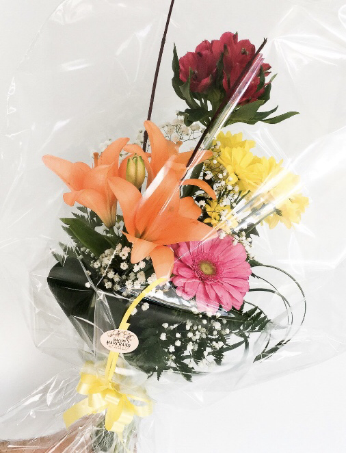
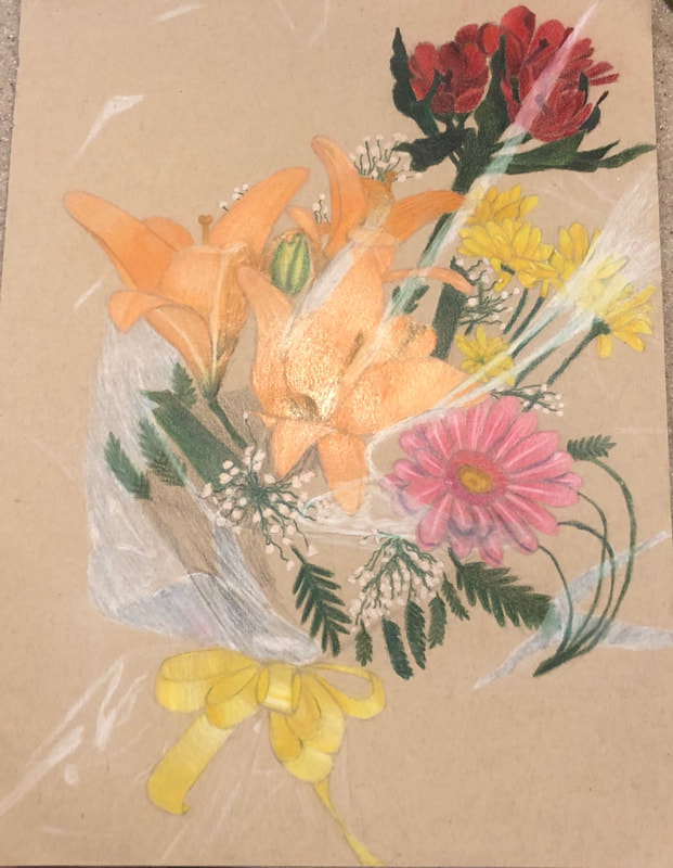
1. Describe the craftsmanship of your drawing. (Is it neat and well executed?) I don't feel like my piece is that neat because you can still see all the lines when I was coloring. Also you can definitely see all the graphite lines from my sketch. It looks pretty neat over all though. The colors look good and I actually like blended the colors and burnished some of the drawing. 2. Describe how your background choices help unify the three artworks and tie them together as one piece of art. 3. Describe your choice of colors/color harmonies and how you used them throughout the artwork? For my color choices I just went off my picture. In the picture the flowers are warm colors like orange, red, yellow, and pink. All around the flowers is greenery which is a cool color to like the flowers stand out. 4. How did you create contrast in your drawing? I created contrasted mainly with color as discussed above. The flowers are warm colors and the greenery is well green. The plastic is white which still even though its a light warm color is it not completely opaque so there is an obvious difference. 5. How did you use textures, highlights and shadows to enhance your artwork? Flowers are relatively smooth so there wasn’t much texture to create. For the highlights I used more white along with lighter colors. For the shadows I used some black and blended it into the rest of the where the petal. 6. Why did you choose a particular background color to mount your artwork? I just kept my background as the color of the paper because i thought it’d help the flowers stand out more. Also I enjoyed how they looked against the brown background. Plus in my picture there wasn’t a background. 7. Discuss the importance of understanding the media (prisma or pastels) and acquiring the skills necessary to create a successful project. It is always important to understand your media because then you can use it to your benefit as much as possible. I understand prismas I thought well but after this project I definitely learned a lot. This looks a lot better than anything else I’ve done in prisma. I also used pastels for the highlights and the excess plastic. 8. Describe any difficulties you had creating your drawing and what you could do to improve your drawing? I didn’t have much difficulty with the flowers I really like those. Of course my biggest difficulty was the plastic. I feel like the white of the plastic stands out to much around the flowers but i dont know how to change that. I probably could blend the white with brown so it blended in more. Planning Sketches
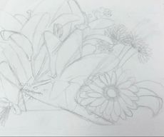
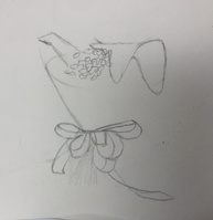
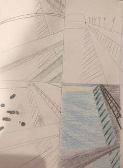
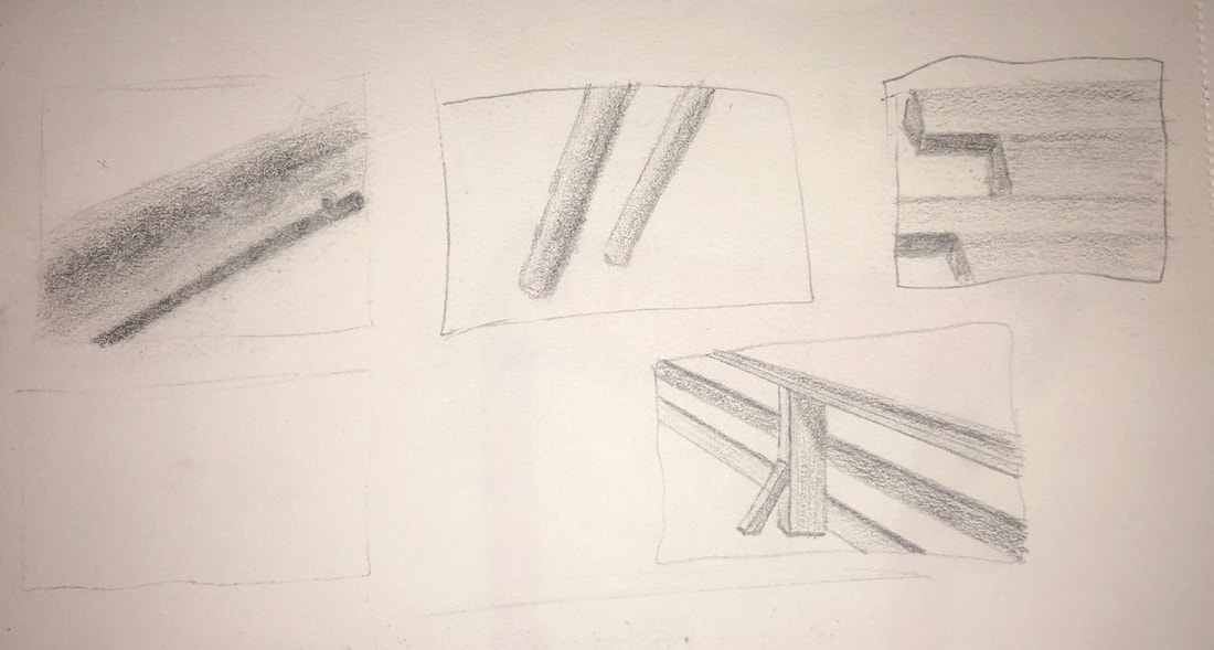
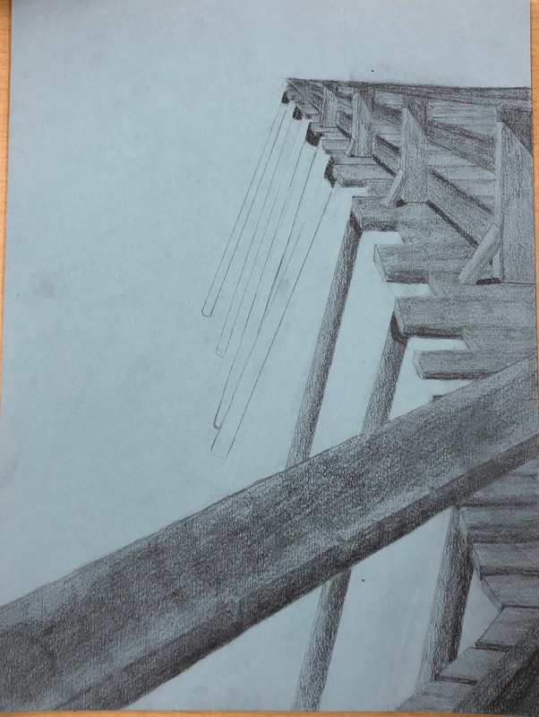
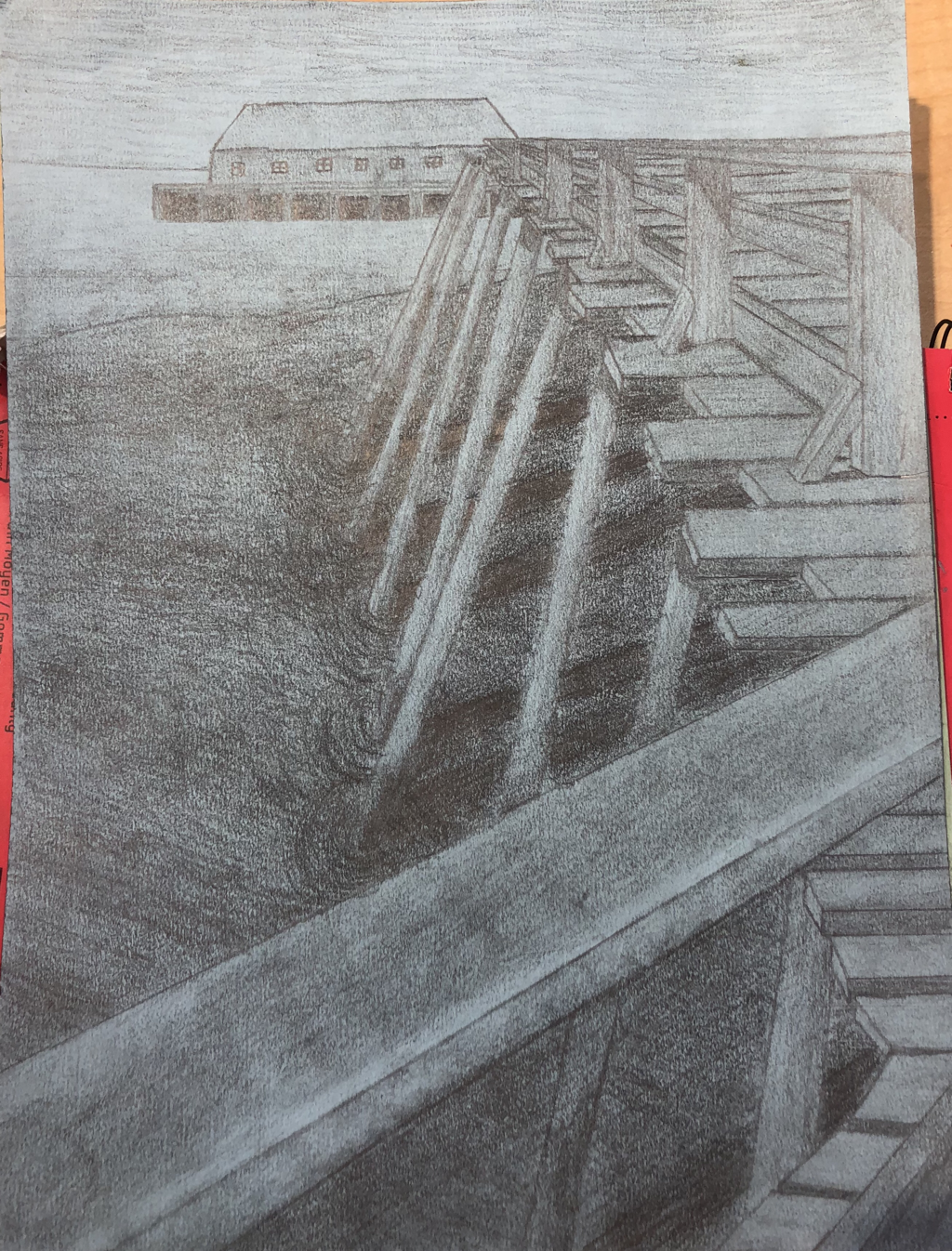
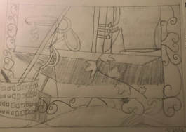
These are my planning sketches, they are a little mismatch. The ones in the top left are my first composition sketches. The perspective is very far off, which is why I have so many sketches. The ones on the right all go together; they are just different pictures, so they fit better. Again the perspective is off besides the last one. In the bottom left are the sketches to help me practice value, those are pretty good. In Progress Pictures
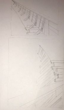
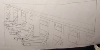
Honestly I think it just gets worse. The pier it's self is good as you see in the first one. Over time as my hand smudges it, it begins to look worse and worse. Also as I add more details it doesn't look as good because I never really practiced those parts of the picture; I didn't think it'd be a big deal. I guess that's my fault though, oh well. The wood on the pier still looks decent at the end just with less value because it ended up on my hand or arm.
1. Describe how you created an interesting point of view? Was it successful? Why or why not?
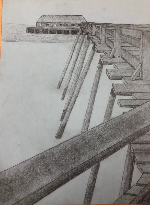
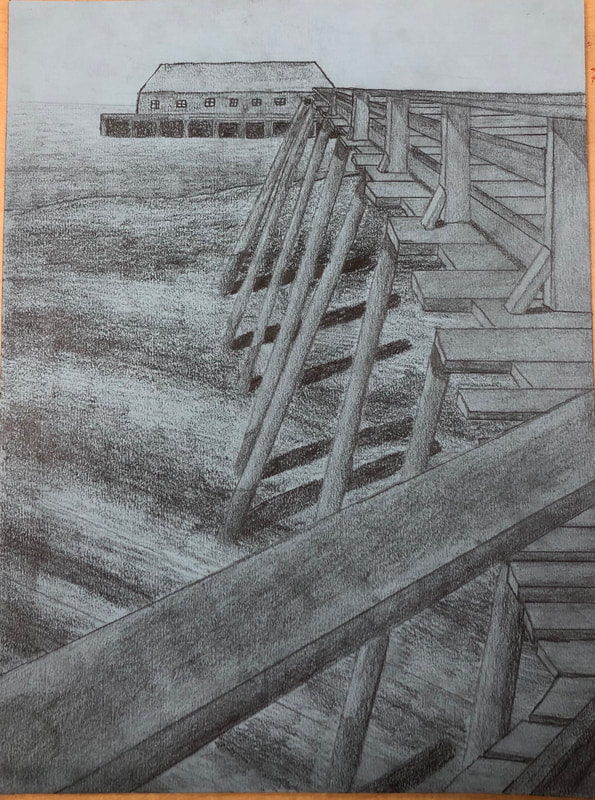
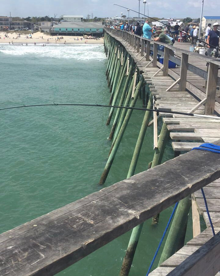
I didn't really have to do anything to create my interesting point of view it's just from a picture I took over the summer. The view of the picture is successful because in it you can see basically the entire length of the pier. My perspective in the recreating is correct it just appears as a much shorter pier. 2. Why is it important to understand perspective and how to draw it? It is important to understand perspective because there is perspective in everything even if you don't notice. I've taken an art class every semester since I've been at Apex, so I've started to see all the artistic sides of the world like every perspective or the value in all the leaves. It's even more important to know how to draw it because it makes your drawing look three dimensional and more realistic which is a huge part in drawing. 3. How were the colored pencil exercises important in the success of your piece? My piece is in normal graphite pencil, so I'm just going to answer this based off that. The pencil exercises were very helpful because through out my piece I was thinking about including the whole range of values. Most of it is just rectangular prisms so there isn't a whole lot of value, but there is still some and I exaggerated that. I believe I did use the whole range of values. 4. Describe the craftsmanship of your colored pencil. What techniques were used? (How well the project is technically crafted). Same as previous question, graphite pencils. Most of my piece is with the B side of the pencils which means it is soft lead and blends easily. I started on the right and went to the left, so the side of my hand smudged most of it to make my piece a lot less neat. Still the piece is relatively neat and well created. To make the gradually changes in value I imagined like pull the darker value into the lighter value. 5. Were you able to achieve depth by showing a foreground, middle ground and back- ground? Explain. There is an obvious foreground, middle ground and background. The diagonal plank on the railing is the foreground because it is the closest to the viewer. The middle ground is the rest of the pier because it is what's going back but doesn't go into the background. The background is the building because it is behind everything. 6. Explain your experience with colored pencil and the project in general. What were the obstacles and advantages? My experience with the drawing pencils was pretty good, except for the part where I went to third period with graphite all over my hand and some on my arm. I learned so much by using them, also while using them it is much easier to create all the different ranges of value. I almost always use pencil, so I was somewhat skilled. But know I'm even better at using them which is an advantage because as of now it is my preferred media. 7. Looking back on the progression of this project what skills, techniques or other information would you like to have been taught? Do you feel you were prepared for this project? One useful skill would definitely be how to avoid getting graphite all over your hand, but that is probably inevitable. The water was the hardest part just because I really had no idea what I was doing there, but I don't know what skills would help with that. Differentiating parts that have the same value but aren't one thing would be a good technique to have. Overall I still felt prepared for this project, especially since I did like ten sketches before I started.
To learn perspective we watched videos and followed along to create the drawing. From left to right is one point, two point, three point perspective. Two point and three point were new to me, but I think they look better than the one point. I think the one point looks bad because I've never learned off a video, so I had to get use to that first. The two point was probably the most fun, I don't really know why. My three point probably looks the best through, most likely because over time I got better.
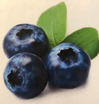
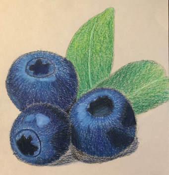
As you can see I decided to draw blueberries. The picture on the right is the reference photo. The picture on the right is my recreation. While I was drawing them I thought it looked so bad, somehow once I added the shadow they seemed to look a lot better. My colors are pretty accurate except I don't believe I got dark enough, but that's consistent so it's okay. Also the front blueberry is a little to small. Although that one is my favorite because I think it has the best value changes. The leaves are decent I didn't spend a lot of time of them because I mainly just looked at them as extra. I believe that my blueberries are pretty accurate, so I like them.
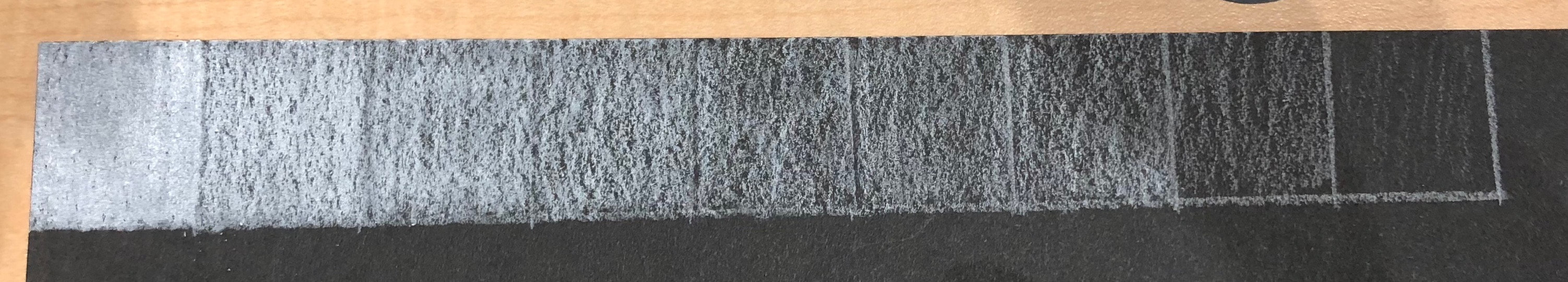
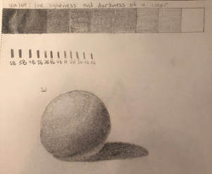
Value Chart
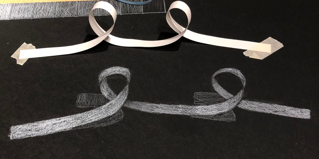
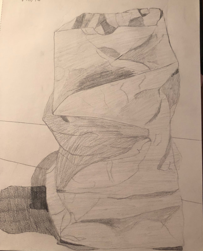
Curled paper
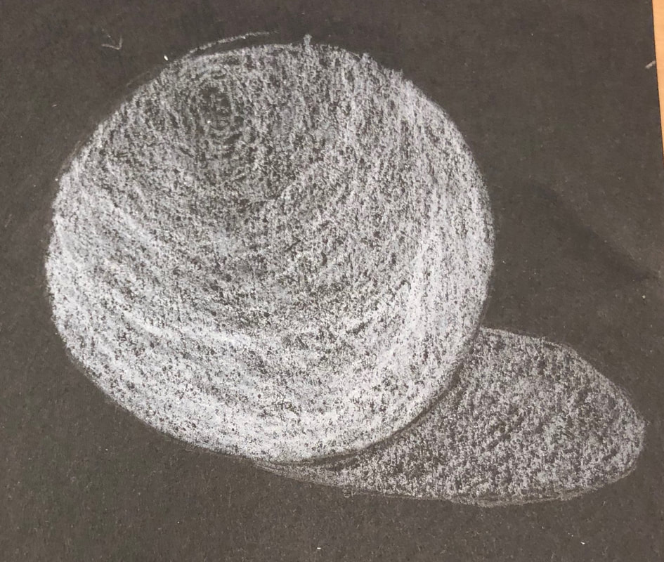
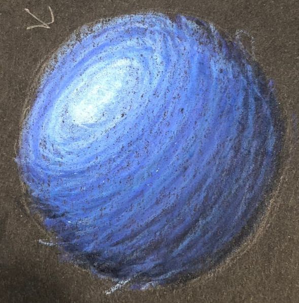
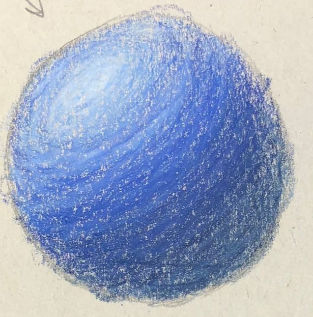
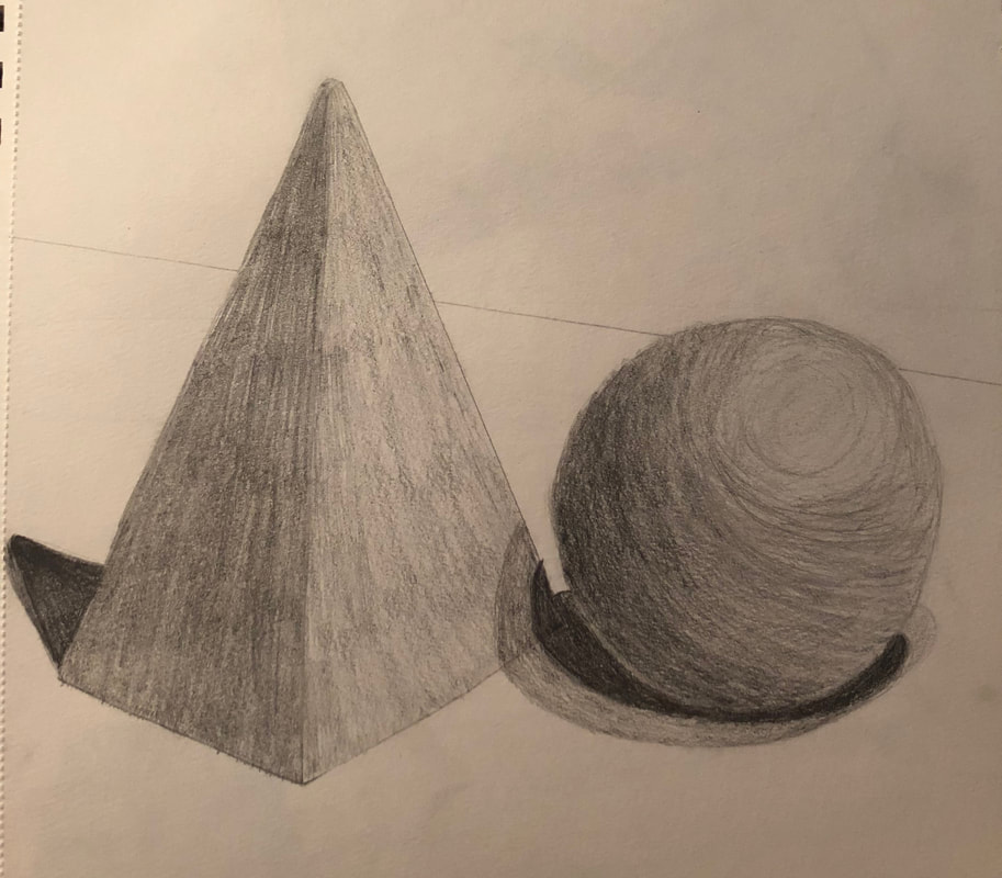
Spheres
Planning sketches
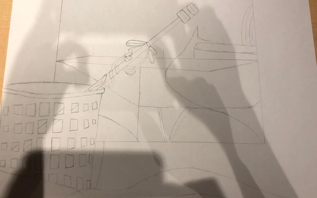
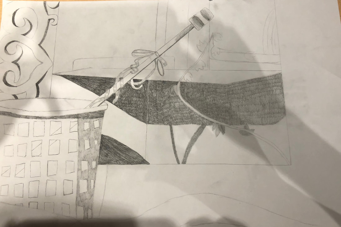
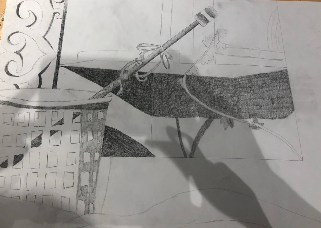
In progress pictures
These are my in progress pictures. Sorry about the shadow, the studio lights were on. In the first one its just a sketch of where everything is going. The second picture has value and some shape to it along with a couple more shadows. In the last one there is some more value and shadows plus more detail in some objects. Final piece Critique Questions
1. Describe the craftsmanship of your drawing. (Is it clear, clean edges, blended well, smudges, defined space, etc.) This piece has decent craftsmanship, of course it could always be worse but it could also be better. We were working with soft drawing pencils, so whenever you dragged your hand across the paper it smudged the lines and value. Most edges and clean because I drew them with a hard pencil that doesn't smudge easily. The blending is good because the accidental smudging helped that out to make it slowly transition. Also through out the unit I got better at transitioning from light to dark. 2. Are your values and shadows realistic? How many values did you include? How and why are values important? I think my values and shadows are realistic, I drew what I saw. I added a little value to everything, except highlights, because no where else should be just white. I used all nine shades of value because everything has it's own value based on how and where it is set up. Values are important because they show the shape and volume of an object to make it look more three dimensional. Depending on how you create your values, whether there is an obvious change or gradually, both are needed to create a good piece. 3. Is there a clear source of lighting? There is not completely a clear source of lighting. At first glance the light looks like its coming from the left of the still life, it kind of was the sunlight from outside. Sunlight is obviously brighter than the studio lights so its hard to see the highlights that the over head lights create. 4. How important were the composition sketches? Explain My composition sketches were actually trash, so I shouldn't be allowed to answer this question. The sketches helped me to like plan out where everything was going more than create a composition. Because once I did a couple I already knew which composition I was going to do. 5. How is your final drawing successful? My final drawing to me is successful because there is a big difference between the beginning of this unit and the end. I easily created gradual value, which I normally struggle with. I learned and applied my knowledge of all the different drawing pencils, so I got an even bigger range of values. Also the spacing and how I placed everything on the paper was accurate. 6. Are the proportions, structure and perspective of the subject correct? All of these are correct but they don't look like it at first. That's because you base everything off the frame because it basically goes around everything in this picture. Since the top part of the frame is cut of it's hard for you to immediately realize that it makes the frame smaller and closer in size to the other objects. The proportions are accurate because I was checking those while I was drawing because it bothers me when they are not equal. The structures of each object look like they are suppose to, like they have all the basic details in the outline. 7. Does the placement and grouping of objects create a pleasing arrangement (composition)? This grouping is a good composition because it has asymmetrical balance. The basket is in the bottom left point as the foreground and center of interest. The part of the truck shown in the picture is in the background in the top right point. It makes the arrangement asymmetrical because both sides are not equal with amount of positive space. 8. Is there a center of interest and is it well located? The center of interest is obviously the basket, because it is basically the foreground and it's the first thing you see when you look at the picture. After observing the basket your eye notices the rod and follows that to the opposite corner, but along the path it sees that rest of the drawing. 9. How well did you manage your time and resources throughout the process of creating this drawing? Do you see where you could improve in this area? I did not manage my time well. I kept getting distracted, not even by like other people, just myself not being able to focus because my brain just like wasn't there. I could improve on this by working harder to stay more focused. I used my resources well, I used a variety of drawing pencils to create the values and all in the drawing. 10. What challenges did you encounter during this project and how did you overcome them? I had the problem of everything blending together since we were only working with the gray scale while the reference was colorful. When looking at the reference all the pieces were obviously different because of their color. Once you take that away you have to add value that you don't necessarily see to create the difference in objects. 11. What have you learned drawing a still life? I learned that it is difficult to draw a still life in a classroom because it slightly moves daily. I also learned that each objects needs to be set apart from the others whether with the value or drawing pencil or the color and shading of colored pencils. Throughout drawing this I improved on that, that is why some parts are better than others. I learned from the worse parts, so I could make the better parts. Value Scale and testing out pencils
Value on regular shapes
Value on irregular shapes
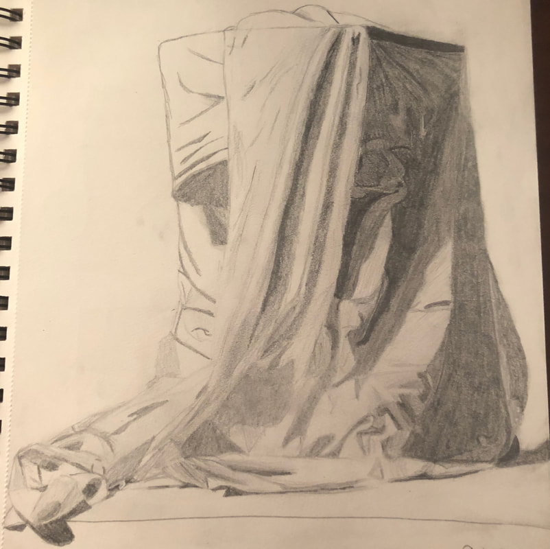
Fabric Drawing
|